Review of Summer Programme 2015
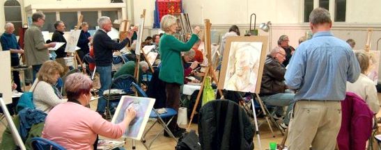
The 2015 Summer Programme started with something different straight away by attending Sele School and sketching members of the Hertford Choral Society at one of their rehearsals. This was a wonderful evening, we were greeted and accepted into their company in a very friendly manner and not only did we get to paint but we were treated to some very nice music. I believe also that some of the members may have sold some of their artworks as a result of this evening.
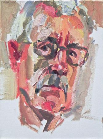
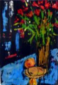
Artwork to John Jarratt
We also visited various and widespread parts of Hertfordshire including:
- Bramfield Village, to paint in the grounds of one of the grand houses established there and afterwards we were welcomed into one of our members houses, who lives in the village, to complete a lovely evening.
- Stanstead Abbots, one of our favourite venue’s where it is possible to paint some colourful narrow boats and waterside scenes.
- Archers Green, another attractive venue and painting hotspot.
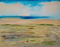
- Standon Village was a pleasure to paint as the evening light was perfect and the picturesque rose covered painted cottages were just asking to be painted.
- Hertford Heath again another picturesque local village was a joy to paint and of course there was the abundance of “typical village” pubs to refresh ourselves after.
- Saint Albans was a venue we rarely attend but was steeped in history and assorted scenes, from roman remains, to attractive ponds all good, interesting subjects to paint.
Artwork to John Jarratt
All of these evenings were well attended which made them the more enjoyable to be attending.
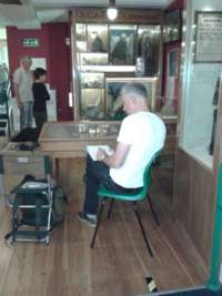
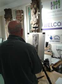
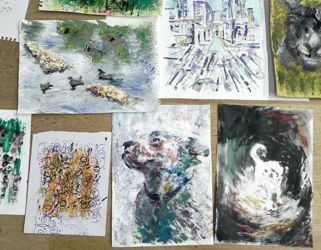
There was a very interesting visit to Hertford Museum where we were allowed to sketch the artefacts within the museum. It was very well attended and some of the artwork which was produced was of a good quality and interesting content. It was intriguing to see what actually can be sketched / painted within a museum environment.
I would like to recommend to all our members to try and attend the summer evenings because not only do you get to meet other members, but you also get the chance to see some of the beautiful villages, buildings and scenery that we have in Hertfordshire.
Paul Swinge
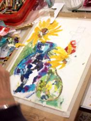
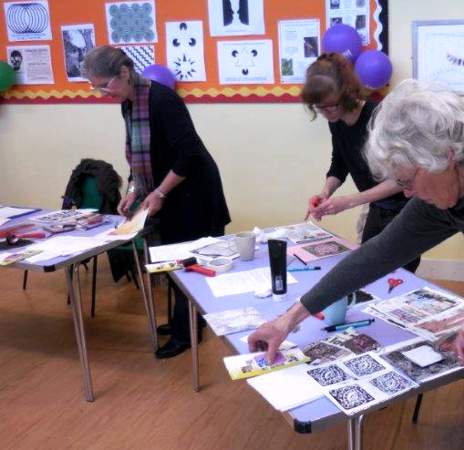
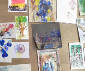
Collage Workshops at Hertford Museum - 17th June 2015
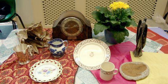
Following a successful Printing Workshop in March, Hertford Museum ran two workshops using Collage as a medium - with a still life set up using items from their varied collection of artefacts as a source of inspiration.
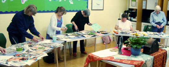
Two Collage workshops took place on 17th June (one in the morning and one in the evening) in the well-appointed studio at the Museum, 18 Bull Plain, Hertford SG14 1DT. Collage truly emerged as a medium in its own right in the early years of the 20th century with the Cubist experiments of Pablo Picasso and Georges Braque who coined the term Collage (from the French: coller, "to glue). Sara Taylor, Museum Curator, presented some well-known images from these early 20th Century artists and others, such as David Hockney and Robert Rauchenburg, who use collage in their work.
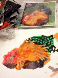
 Participants then developed a sketch using elements of the still life set up with emphasis on bold forms and interesting contrasts and transferred their design to thin A3 card. Artist Kathy Burman gave advice on design, materials and techniques. Magazines and newspapers provide a huge range colourful and stimulating images and additional papers can be created using acrylic paint. Papers can be torn or cut to shape, layered and glued using PVA or wallpaper paste.
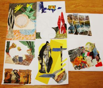
Choices were made and, gradually, interesting images began to take shape - some abstract, some with historical references. Using found materials in this way gives free rein to the imagination and unexpected results occur. The final pieces were very exciting - referring to the items on display but in very personal ways. Collage was a new medium to some of the participants - others had used it previously. All found it absorbing and a wide variety of styles and images resulted.
Further art workshops are planned and there is always something interesting going on at the Museum for visitors of all ages. Check the museum website for details www.hertfordmuseum.org.
Collage Workshop - 21st April 2015
While artists have been layering images and incorporating elements into their work since the advent of paper, collage truly emerged as a medium in its own right in the early years of the 20th century with the Cubist experiments of Pablo Picasso and Georges Braque. The term collage was coined by these artists in the beginning of the 20th century when collage became a distinctive part of modern art. (from the French: coller, "to glue).
Matisse is famous for his “cut-outs”. Blue Nude II [wikipedia link] is a beautiful example. Collage featured in Pop Art, and occurs in painting - applied materials, canvas (torn and reformed), photo- montage (think of Hockney’s highway and landscapes), 3 dimensions (using organic materials (wood, metal) or found materials (man-made, rubbish) and, most recently to digital collage and collage techniques in film, architecture and music.
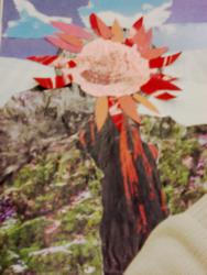 It was with these thoughts in mind that artists embarked on a collage workshop led by Kathy Burman and Stella Hunt, members who love to use collage, either as a medium in itself or an element in a painting. Inspired by a still-life set up chosen with emphasis on strong colour contrasts and pattern, artists worked on creating compositions using magazines and newspapers which offer an amazing array of brightly coloured and patterned materials. For background, some members chose old paintings to enhance while others worked on card or heavy-gauge paper. PVA was the glue of choice for some, others tried wallpaper paste. Shapes were either torn or cut with scissors.
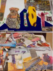 Collage is the most democratic art medium of all, and it is so user friendly. Collage materials are common and available to everyone – purchased, found, recycled, made. There are no rules, just the aim of producing an artwork with a strong composition, use of light and dark, warm and cool colours - the basis of any good image be it using paint, print or, in this instance, found materials. The studio soon became a blitz of colour and buzzed with concentration as members explored the visual challenges and delights of finding just the right colour or tone. As always, no two works were alike and there was great variety in the way this workshop was approached. The resulting images were stunning and these collages could be further worked on at home or could be used as reference for a painting or print. This was a very productive evening and was certainly a new direction for some members, even if this is to use collage as a sketching tool alongside their painting.
The fun in collage is that the artist doesn’t really know where it is going. Often the materials inspire a direction which you couldn’t possibly have planned, a colour or pattern which demands to be placed in just the right spot. The results are always unique and often very exciting – completely different to applied materials - paint. Everyone brings their own “self” to the process working from imagination or from an image or still life set up. It can be playful, intense, loaded with reference and imagery, representative or abstract. Mostly it needs to be yours.
Contemporary collage artists include: Romare Bearden (figures in exciting settings), Ray Johnson (portraits using text), Robert Rauchenberg (mixed media – topical), Ann Ryan (simple abstract shapes) and Robert Motherwell (mixed media – abstract) (and the list goes on).
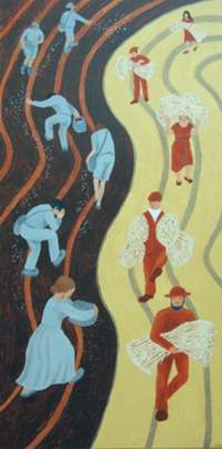
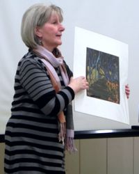
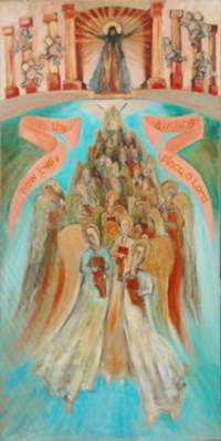
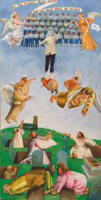
Painting a Requiem - 28th March 2015
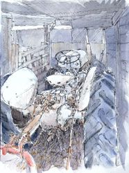
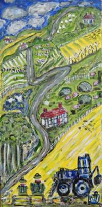
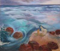
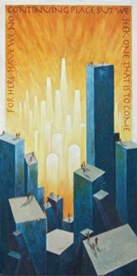
The Art Society got together with the Hertford Choral Society again this year to illustrate the Choral Society's Easter concert, held in All Saints Church, Hertford. This year it was Brahm's Requiem, traditionally sung in German. We supplied large pictures to hang from each of the aisle pillars, based on the text of Brahm's libretto. As ever translation of the sung word into an appropriate image produced a range of artistic responses. My favourites were Persis Limbuwala's take on the text ‘The farmer waits for the precious crop from the earth’ - a Hockney landscape with an unbiblical tractor parked at the bottom, waiting to get to work; and John Jarratt's vision of a persecuted people ‘with no continuing place, seeking one that is to come’ - a futuristic picture of a crowd of manikins dwarfed by their urban surroundings gazing at some ethereal cityscape. Oh, and Marianne Dorn illustrating ‘Lord, let me know my end, and what is the measure of my days’ with a seascape overlooked by a man and his horse. A horse? What’s that doing there? It’s a Marianne picture, horses are more or less obligatory.
This year the Choral Society asked its members for their reaction to our work. Here are some of the choir's remarks:
|
“I loved the pictures… anything that adds to our understanding of the music and gives us another viewpoint is really helpful and inspiring.”
“Long may the Societies’ links continue – as a visitor this is the first such association I’ve come across.”
“Illustrating different movements of the Brahms, these pictures are an excellent visual aid to the music. Thank you HAS!”
|
“It was very interesting and thought - provoking to see the way artists reacted to the text of the Requiem.”
“The pictures express the meaning in a different way from the music and the artists enhance our understanding of the music. Well done HAS!”
“Very expressive paintings – dramatic and poignant; well-researched and painted. Well done!”
A big bonus of our collaboration with the Choral Society is that we are invited to set up our easels in the church on the afternoon of the concert, when choir, orchestra and soloists come together for the first time and go through the programme as the choir's final rehearsal. We are up close and personal with 40 musicians and 60 singers all doing their thing and leaving us free to attempt to capture the scene in front of us. The music is inspirational as it swirls around us: the challenge of capturing orchestra and choir in full flight well-nigh impossible. But great fun to try.
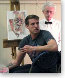
Portrait Painting Evening inspired by Tim Benson ROI – 23rd March 2015
Cowbridge Hall was jam-packed on the Tuesday evening following Tim Benson’s portrait demonstration and we were fortunate to have two models.
Many members experimented with the same limited palette, using one large brush – many didn’t, preferring their favourite medium but still working boldly on a fairly large scale. Their were some excellent portraits produced in just two hours and everyone enjoyed this follow-up session as Tim’s technique was very fresh in our minds.
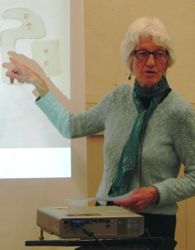
Portrait Demonstration by Tim Benson ROI – 17th March 2015
Over 60 Members of the Society gathered for this portrait demonstration by contemporary artist Tim Benson. Educated at Glasgow School of Art and Byam Shaw School of Art from 1998-2001, Tim has received recognition with his election as Vice President of the Royal Institute of Oil Painters and has just been appointed Co-Director of the Diploma in Portraiture at the Heatherley School of Fine Art in Chelsea.
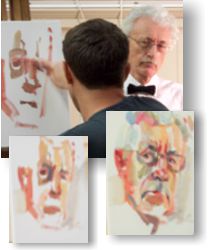
Our model, Tony Holbourn, presented Tim with the kind of challenge he enjoys. As a practised figurative artist he not only creates a distinguishable likeness of a subject but moreover evokes the sitter’s character and mood. He is never satisfied with simple representation, rather concentrating on bringing to his work an emotive and often visceral quality.
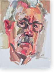
Tim works with a limited palette of oil paints: Titanium White, Burnt Umber, French Ultramarine, Lemon Yellow, Cadmium Red and Alizarin Crimson. He occasionally uses Cobalt and Ceruleum Blue. He enjoys working in bold strokes using just one large flat brush for mixing and applying colours, which he cleans in white spirit as needed. Tim finds that this is more straightforward than having a multitude of brushes on the go. When working on very large canvasses he chooses decorating brushes – in order to make marks in scale with his canvas. He sometimes works on a pre-tinted canvas but this evening works directly onto the white, unprimed surface.
Using warm tones, Tim boldly sketches the head, deliberately larger than life and offset so part of the top of the head is leaving the canvas. He holds his brush like a stick to achieve a good range of motion. He quickly blocks in the eye sockets, the shadow of the nose and the mouth. He likes to exaggerate salient features – lengthening the face perhaps. Having established the form, gradually building up the shadow areas in warm browns, Tim blocks in areas of background. He does this early in the process to establish the tonal range in order to build up the whole painting as one.
 Tim was pleased to discuss his approach and technique and welcomed questions. When executing a smallish painting which may take 3 hours or so, he estimates that as little as possibly 30 minutes is actual “painting time” as much time is spent looking and planning and mixing the right shades of paint. He regularly cleans his palette when needing fresh, clean mixes and prefers to execute his paintings in one go, working wet on wet, using inexpensive paint straight from the tube. He alternates between large marks, areas of tone and small marks or lines (often using the end of the brush for these). As he works he gets to know the sitter and the face, latching onto interesting areas which he can highlight. No offense to Tony, but Tim described portrait painting as “painting a bowl of fruit” – its all about observation, lighting and interesting mark-making. The paint texture is an integral part of Tim’s work.
The portrait gradually came to life with lots of stimulating marks and colour choices, redrawing as necessary into the wet surface. The later touches were deftly added or scratched in. Tim would probably have worked on this a little longer in different circumstances but was happy with the result which Tony, our sitter, was delighted to be given.
This was an outstanding evening and Tim was warmly thanked for giving us all such an exciting demonstration of his technique.
Printing Workshop at Hertford Museum - 11th March 2015
Hertford Art Society is working closely with Hertford Museum on a series of art workshops, using the wonderful collection of artefacts in the Museum as a source of inspiration.
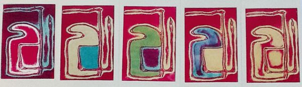
Two Printing workshops took place on 11th March (one in the morning and one in the evening) in the well-appointed studio at the Museum, 18 Bull Plain, Hertford SG14 1DT. Sara Taylor, Museum Curator, began the sessions with a presentation of some interesting objects from the collection, focussing on the design elements of man-made items such as tiles, masks, instruments together with natural objects including some beautiful fossils. Participants then spent a short while sketching some of the exhibits with a view to designing an image suitable for printing. Artists Kathy Burman and Paul Swinge gave advice on design and introduced the materials which would be used - in this instance the block was created using polystyrene which has the distinct advantage of being easy to carve and mark. A sample piece was provided for experimenting with various tools. Fine lines can be carved with a blade and a great variety of marks and indentations can be made with anything from a bottle top to a fork. This material is ideal for a workshop (and would be particularly suitable for children).
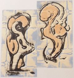
 Some exciting designs emerged and were soon transferred to the polystyrene blocks. Waterbased printing ink - initially in black - was set out on sheets of glass and small rollers used to transfer the ink to the block. Once an initial print was taken, the block could be modified and additional texture and linework added as desired.
Coloured papers were available as well as newspapers which provide interesting coloured background for prints and the studio was soon buzzing as participants experimented with different backgrounds and coloured inks, sometimes overprinting the original black image with the same image in colour. Additional small blocks (just right for a greetings card) were engraved and printed. Prints were left to dry on the rack (to be collected later).
These enjoyable sessions were well attended and a wide variety of images produced, based on designs found within the Museum’s exciting and varied collection. Further art workshops are planned and there is always something interesting going on at the Museum for visitors of all ages. The next workshop takes place on 17th June and will focus on the wonderful world of collage. Check the museum website for details www.hertfordmuseum.org. Members of the Hertford Art Society are looking forward to an evening of drawing and sketching at the Museum on 14th July 2015 as part of the Summer Programme.
How we do it – Illustrated talks by three Members of Hertford Art Society - 10th March 2015
Wash off paint technique presented by Maureen Batty
This technique produces striking images using gouache paints and black waterproof ink. Sketch your design on a ground of watercolour board or good-quality, heavy watercolour paper which has been stretched and taped to a board. Working with good quality gouache paints create a bold painting (bright colours are most effective with this technique).
Apply the paint quite thickly; if it is too thin the ink applied subsequently may mix with the paint. When the gouache is bone dry, use a large brush to cover the whole paper with an even coat of black Waterproof Indian ink or Calligraphy ink. When applying the ink, make sure your brush is well loaded because if you try to go over an area again the gouache will begin to mix with the ink and the final effect will be spoiled. Use a large, soft brush and Work quickly, “floating” the ink on – too much pressure will cause the gouache beneath to dissolve and mix with the ink.
When the ink is completely dry, hold the painting under cold, running water until you have an image you like. The water causes the top surface of the soluble gouache paint to dissolve and it is washed off; the areas of dried ink covering the gouache disintegrate and are washed off at the same time, but the ink in the unpainted areas remains. The result is an exciting coloured image on a black background often with unexpected marks and tones. Maureen enjoys the way that you can never predict the outcome with this technique and has produced a number of vibrant artworks using this method.
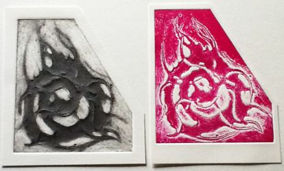
Printmaking using Carborundum presented by Ruth Freeman
This is a collograph printmaking technique in which carborundum powder is embedded in a design created using acrylic or PVA glue. The powder comes in three qualities (fine, medium and coarse) and depending on which grade is chosen and the quantity used a robust printing block is created which can be re-used to give vastly differing results depending on how the inks are applied and what other additional materials are incorporated.
This shows the difference between a relief
and intaglio print from the same plate.Ruth explained that she creates a design using PVA glue applied to thin, rigid card, manipulating it to give varying lines and textures. Carborundum powder is then generously applied so that it is absorbed by the glue. The block can be firmly rolled to compress the plate which is then allowed to dry and varnished to preserve.
Use of chine colle / tissue paper
Combining images
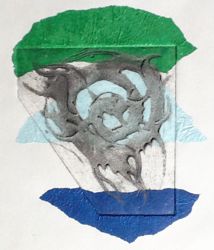
Variety of ways of dealing with a simple image - a range of multicolour prints can be achieved by cutting acetate shapes based on the original print and used in combination as masks or for overprinting.
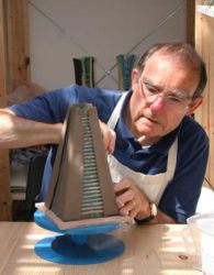
Examples were handed around to illustrate the variety of results which can be achieved using individual blocks, including this image showing how a painterly image can be achieved . Ruth is fortunate to have the use of a professional press in making her prints. Ceramics - creating a fishing hut wall plaque by Nigel Earle
Nigel has been inspired by observing, photographing and sketching the gradual decline of some of his favourite beach huts to create a series of wall plaques which complement his range of 3D ceramics. He enjoys experimenting with clays of different hues and decorating his work with a variety of glazes and oxides to achieve depth and texture.
Illustrating his talk with images of all stages, Nigel described the process of designing and assembling the many pieces which make up this plaque. Photographs and notes of the main steps are given below.
Using a basic buff clay a thin sheet of clay is rolled out, the background shape cut out together with strips to form some of the features and a grid of additional supports. If the clay is soft these can be attached directly or with the use of slip (a paste of dissolved clay). Holes for eventual fixing are inserted.
A piece of porcelain clay is attached at the top, washed with a coloured underglaze. Clays of different colours are used to give variety to the façade. Wood effect is achieved on some by rolling the clay over wood with a distinct grain. These strips are supported to avoid slumping and attached carefully using slip.
Porcelain clay is rolled over corrugated card to give a vertical area and the small shapes (to suggest pieces of asphalt) are formed using emery paper for texture. These shapes will be fired separately and attached with epoxy resin at the final stage. Trimmed metal pins and washers are added which will melt during firing.
The plaque is bisque (biscuit) fired (the first firing at c. 1000 degrees C). Various tints are added using oxides and thin glazes. After biscuit firing additional tints can be added together with broken coloured glass and glaze in the sunken areas (the “windows”).
This is the final piece after stoneware firing (c. 1240 degrees C.) and with the additional small shapes glued in place. The metal studs have spread further, the contrasting clays are well defined and the textured areas give an impression of a weathered, about to collapse fishing hut with the light reflecting from the still bright windows.
Nigel has a great affection for these run-down but charming fishing huts and lamented the fact that the one in his initial sketch has, sadly, been torn down and replaced by a new (for that read charmless) hut.
This was a very enjoyable evening, giving Members the opportunity to learn about these varied techniques. Maureen, Ruth and Nigel were thanked for their most interesting presentations which, in all likelihood, will inspire others to try their hand at mastering a new skill.
Pottery Painting Workshop with Manic Ceramics – 24th February 2015
One of the pleasures of life in Lower Bengeo, Hertford, is to walk past the delightful Manic Ceramics pottery in Port Vale when it is in full swing, packed with excited children happily painting their own designs on mugs, plates and bowls under the expert and benevolent eye of Deborah Bonfield and her team. Even when the pottery is closed there is always a wonderful assortment of finished work on display in the window.
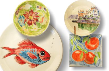
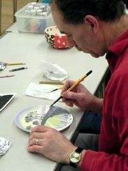
It is clear from the Manic Ceramics website that it is not just children who go there to paint pottery, and on Tuesday evening the Little Blue Shop came to the Art Society. After a brief explanation of the process, Deborah handed out paints and brushes and we all set to work, soon becoming absorbed in a process which was completely new to many of us. Some students had clearly done their planning in advance, while others' methods were more spontaneous! Deborah then packed our efforts away and took them to the pottery to be fired and was thanked for her enthusiastic advice throughout the workshop.
The pots, mugs and plates resulting from the evening were returned looking bright and colourful – some were “paintings” in their own right, others more abstract expressionist. Whatever the style, everyone agreed that it had been great fun and some may be inspired to create further works using clay as the starting point.
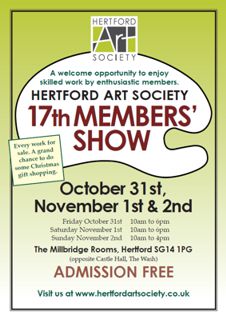
Review of the 17th Members’ Exhibition - October 31st – November 2nd 2014
The 17th exhibition of members’ work took place at The Millbridge Rooms, Hertford. Once again, the work was of an excellent standard, a fact commented on by a number of visitors, and we can be proud to showcase our work in this way.
This year we sold 8 paintings, 1 wall plaque and 1 3D figure plus 13 unframed works. This total of 21 works compares favourably with sales last year. Well done to those who gave their time to steward the exhibition. Card sales were good and my thanks go to all who managed the cards so well and to all those in the handing-in team, the hanging team and the handing-back team. The success of this exhibition is entirely due to willing volunteers who recognise that this is their own exhibition, showcasing, as it does, the work of the Hertford Art Society.
 Peeled Orange Best Still Life by Lorenzo Rizzi - Oils |
 Waiting in the wings Visitors' Choice Award by Chris Baker - Pastel |
Congratulations to our prizewinners:
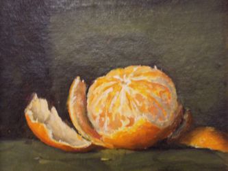
- May Bennett Prize (Best Still Life) - Lorenzo Rizzi for his oil painting 'Orange', a glowing little jewel of a painting.
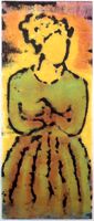
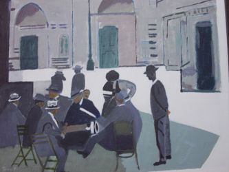
- Mark Ely Award (Most Intriguing Work) - Tony Freeland for his acrylic painting 'Squaring the Circle'. This almost monochrome study of men in hats gathered outside a café in bright sunshine has an odd sense of menace - are they planning something wicked or just discussing football?
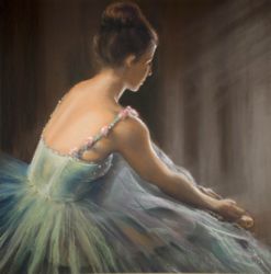
- Visitors' Choice Award - Chris Baker for his pastel artwork 'Waiting in the Wings'. A beautifully accomplished study of a ballerina, with a great sense of atmosphere.
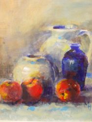
- John Godden Award (Members' Choice) - Marianne Handford for her acrylic painting 'Jandra's Pots'. Don't we all wish we could paint like this - a simple study of pots transformed into a harmonious and colourful composition with a fragmented surface which almost approaches abstraction.
 Squaring the circle Most Intriguing Work by Tony Freeland - Acrylics |
 Jandra's Pots Members' Choice by Marianne Handford |
There were many more artworks worthy of special note, but let me pick out a very few: Janet Benge's witty pencil drawing of a bus queue: Geoff Bennett's 'Autumn', a very successful print in which a farmer ploughs a lonely furrow in a field: Nigel Earle's ceramic wall plaque of Aldeburgh Fishing Hut, quite rightly snapped up at the beginning of the exhibition so we hope he makes more: and a delightfully humorous portrait of a cow, 'Cathy the Cow', by a new member, Georgia Smith.'
The Friday evening party was, as always, a most enjoyable occasion in which the members could meet socially and enjoy the exhibition and the food so kindly donated.
Congratulations to all who took part in the exhibition this year, whether you exhibited or volunteered or both. This exhibition is all about offering a platform to the Hertford Art Society members in which they can exhibit their work. For some it is the only exhibition they enter, for others it is only the first exhibition they enter, with many more to come. It is clear that the visitors love this show and we must make sure we attract even more visitors next year!
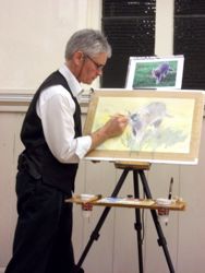
Watercolour Demonstration with David Webb – 18th November 2014
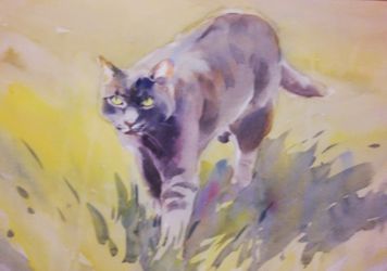 Originally an illustrator, whose work included intricate, detailed work for publications such as field guides and comics, David Webb moved into fine art and now paints in watercolours, landscapes, seascapes, still life, animals and birds. He taught himself to loosen up by setting time limits – endeavouring to complete a painting in 2 hours, for instance. Scoot, the grey tabby was the chosen subject for this evening’s demonstration.
David normally selects four or five colours from his favourite pigments. These are: Phthalo Blue (for mixing greens), cobalt, cerulean and ultramarine (which granulates for stormy skies) blues, cobalt violet, raw umber (good for masonry), burnt sienna (for its transparency), alizarin crimson (again, granulates and gives interesting mixes), light red, vermilion, aureolin yellow and raw sienna.
His paper of choice for demonstrations is Bockingford 200 gsm which was stretched on a board and, working from a photograph of Scoot walking towards the camera through the grass, David began with a light sketch. He drew the head accurately and, using the size of the head as a guide, indicated the basic shape of the cat.
David’s selection of colours for this painting was: cobalt blue, raw sienna, burnt sienna, aureolin yellow and alizarin crimson and he prepared diluted patches of these pigments on his palette He prefers squirrel hair mop brushes as they hold lots of paint and form a fine point for details.
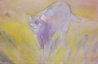
Having thoroughly wet the paper, David used the individual colours, raw sienna and cobalt blue to create greens, burnt sienna and cobalt for soft greys. Having laid down the first washes, he lifted out highlights with a large flat brush.
When the first wash was dry, David added more colour, working from the top and blending the colours to intensify the grass area and add form to the cat, constantly softening edges to ensure that the cat was part of the landscape.
The last stage involved building up the form of the cat, adding the cast shadow with a few flicks to indicate grass. Final touches involved detailing the tabby’s stripes, completing the details of the eyes and face (the most important aspect of the painting) and lifting out the whiskers.
David was thanked for a very enjoyable evening. His technique of gradually building up the image with washes, adding colour when wet and ensuring that the image of the cat “sat” comfortably within the background produced a lovely soft image of Scoot. This needed planning, good preparation and speedy, confident execution - David certainly gave us a good example of how to approach watercolours in this way.
Kathy Burman
No Brushes Allowed! Workshop with Helen Kaminski – 14th October 2014
 A good number of us enjoyed this ‘Mark Making’ Workshop with Helen Kaminsky. We came with a variety of materials which she had asked us to bring, but were not sure what to expect. We were told not to bring brushes! It was good to have tables on which to work to give us more space. For the first half hour Helen demonstrated how to make marks using black gesso and various items such as bottle tops, Lego and even a piece of jigsaw. She also showed us the effects of blowing black paint with a straw and washing over it with a colour when it was dry. It was then time for us to have a go using for inspiration the particular pictures and ideas we had brought with us.
This certainly took us out of our comfort zone. Some of us were feeling our way at first, not sure how to start. Helen came round offering advice and encouraging us to be bold. It was interesting to see the wide variety of styles and subjects when we laid out our work on the floor at 9.30. Many of us were surprised and quite pleased with what we had achieved. We will probably return to using our brushes, but may now be more adventurous in trying out other materials too.
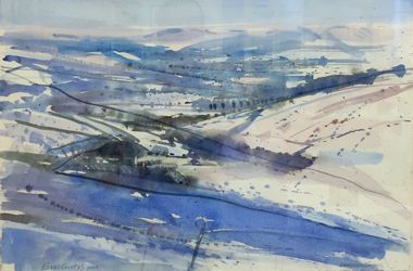
Summer Sketching Evenings 2014
Members and visitors enjoyed this season’s varied programme – there were some lovely summer evenings to enjoy. We revisited the Contessa Riding School where a hand-held horse posed beautifully and there was an opportunity to paint a 1926 Model T Ford parked on the Old Garage Forecourt in the Main Street, Dane End Village. Other local venues provided great sketching and painting opportunities and Parndon Mill and its grounds provided a very peaceful evening with the river gently flowing by.
Near Welwyn Oil Sketch.
One truly memorable evening was spent at Paradise Wildlife Park in Broxbourne. Members arrived just as the regular visitors were leaving and the Park was closing for the day. It was a beautiful, warm summers evening. After a very interesting talk about its 30 year history and current conservation activities we were left to enjoy its many attractions. The animals were in a relaxed mood at the end of the day and many were happy to pose for a minute or two. Quick sketches were the order of the evening as poses were quick to change but there were many opportunities for photographs to be used later.
|
|
The tigers paced, the white lions lounged, the parrots posed and the meerkats stood to attention as the lemurs screeched at passers-by. It was a brilliant highlight of this Summer's programme and thoroughly enjoyed by all the artists present.
These paintings are by member John Jarratt and these are his thoughts on his 2014 Summer painting excursions.
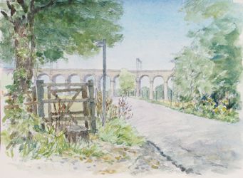
The Viaduct WGC.
“I always enjoy the Tuesday evening sketching sessions where we visit parts of Herts and spend a quiet hour or so painting or drawing. As I live in Welwyn Garden City and can't get going before 7pm some of the sites are too far for a rapidly darkening evening. So on occasion I visit more local sites instead which accounts for the Welwyn Viaduct and the harvested cornfield.
The tractor in a barn at Parndon Mill was also produced during a separate daytime excursion. Of the summer's sketches I think I like this one best and might get a bigger oil out of it.
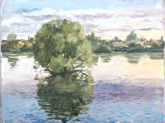
Lake in Lea Valley Park. Oil Sketch.
The view across the Meads at Hertford was done in company with around 12 other members, very much a group, and, while an enjoyable subject, was difficult to catch it's subtlety. The view across the Lea Valley lake also required a race against time with a rapidly reddening and setting sun, first above cloudbanks and then behind them, finally deep red and below the clouds. A challenge!”
John Jarratt
Hertford Art Society Open Exhibition 3rd to 16th May 2015 Cowbridge Halls, Hertford SG14 1PG
Each year this Exhibition is different because, each year, the 600 or so works submitted are judged for a place in the Exhibition by a panel of four eminent, practising artists who are completely independent of the Society. Over the years, our judges have comprised painters, sculptors, graphic designers, members, even presidents and vice-presidents, of the ROI, RI and SWA, to name but a few. Their considered opinions, based on experience, give rise to an individually tailored overview and no one show is quite like another. This year we were delighted to welcome Derek Daniells, Alex Roch, Abel Kesteven and Dr. Waring Robinson as our judges.
The 2015 show comprised 239 two dimensional works and 27 sculptures and three dimensional objects displayed in the spacious and bright Cowbridge Halls. Open for an entire fortnight the exhibition attracted many visitors from a wide area.
The exhibits included etchings, lino and screen prints; oils, acrylics and watercolours; pastel, pencil, charcoal and ink; collage; 3 D works in stone, wood, glass perspex and metal. There was a quiz to keep children engaged, hunting for hares and buses (both of which seemed popular this year). Whatever your taste there was something exciting to see: the delicate, the precise, the raucous the random. Narratives, works of infinite craftsmanship, landscapes, townscapes, abstracts, still lifes, hares and musicians, boats and goats, nudes and shiny things and badly behaved girls. Some works were rich in colour, others favoured sophisticated tonal qualities. Delicate watercolours were shown side by side with gutsy gesso and acrylic. Additional works were displayed at other venues in Hertford and Stansted Mountfitchet.
Thanks go to all the people who contributed in making this, the 63rd Open Exhibition, such a success - it was another exciting and popular show.
This year’s prizewinners
The John Goss Prize - Best in Show
Landscape at Pignano Villa, Tuscany by Daniel Shadbolt - Oils
The Lady Laming Award for Abstract Art
Evening Reflections by Anne McCormack RI, SWA - Acrylics
The Mayor's Award - Best 3D work
A Little Contemplation Vol IX by Marion Hewitt - Cast glass and metal
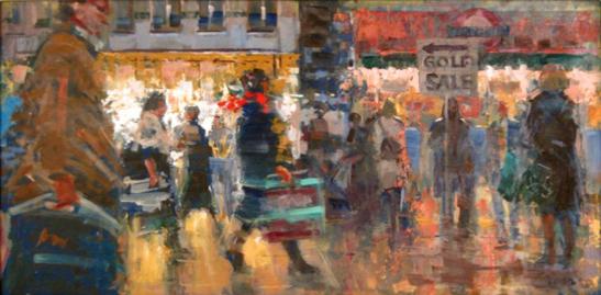
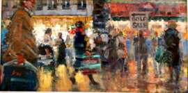
The Bill Dale Award
Golf Sale by Bill Dean - Oils
(the picture showing the most merit, chosen from among works by Members who regularly support the whole of the Society's activities)
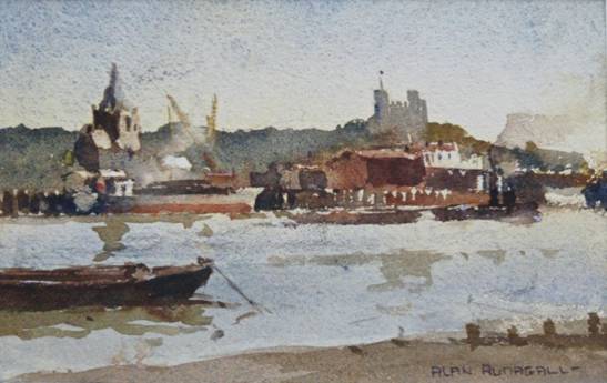
The Edward Mason Award, Best Watercolour Painting
Rochester Skyline by Alan Runagall MRSA
- Watercolour

Visitors’ Choice - over 1,000 votes were cast
‘Day Off’ by Sharon Wright
New Light - a personal selection
A wander around this year’s Open Exhibition made me think - was there a common thread in any of the works? There were explosions of colour and vigour alongside calm and tranquil scenes. Looking in detail at the individual pieces and taking in the wide variety of techniques, my attention was caught. The sun had burst in to Cowbridge Halls with a new brightness, which revealed the 3D works in all their glory. The wonderful shapes, reflections and fantastic effect light and shade had in all of the works. It was the answer to my earlier thoughts, I saw the light.
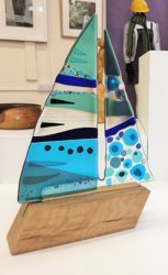
The glass and wood piece, ‘Set Sail’ by Niko Brown drew me in first. Its shapes, refractions and shadows, shimmering as the sun intensified and receded seemed to make the piece alive with light. Mere melted sand and pigment but brilliantly combined to show real character. The stunning, vibrant colours cleverly fashioned described the form, but also revealed the surrounding landscape as the boat sails by. Housed on a wooden base, the grain of which echoed the shapes of waves rhythmically moving past. A fresh and lively piece, technically challenging I feel sure, full of charm and wit.
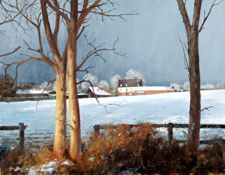
I moved on to a view across a snowy valley to hills beyond, the scene punctuated by trees and hedgerows. The daylight highlighting the areas of snow, with strong shadows in the foreground gradually weakening towards the hills in the distance. I could almost feel the chill of the wind on the hillside. A wonderfully simple watercolour, skilfully executed. ‘Derbyshire Snows’ by Paul Curtis.
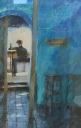
Looking up I found the intense blue wall of a bar with its tiled floor beneath, that told the tale of many feet. Leading to a light room where a man sits confident and at ease at a table with a drink close to hand. I got the impression that the man had escaped from the heat outside, to enjoy a cool beer and recoup. The painting also seemed to hold a hidden story, ‘Down Time’ by Anne McCormack RI in acrylics, a piece that one can return to time and again for fresh interpretation.
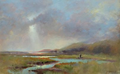
Up early, someone is taking a dog for a long walk, across the marshy banks by the river that runs down to the lake. The conditions seem fresh, but the sun is just bursting through the clouds to soon warm the day. Just oil on canvas, but confidently described with very successful results ‘Donegal Light’ by Rosemary Tinney. The impressionistic technique allowing the eye to fill in the gaps and through half squinting you can really start to feel that warm sun.
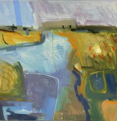
Next the scene set close to a river, where nature comes up hard against man’s industry. Strong shapes and colour marking out the landscape. When viewed closely the shapes are abstract and very actively painted, from a distance these describe the scene perfectly with a fantastic economy that help make this a very interesting and evocative work. ‘Navigation, Snape’ by Clive Patterson, Acrylic on canvas.
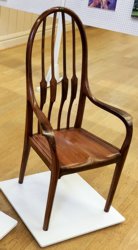
Wow! I was in awe at the patience, dedication and skill that must have been involved in creating this last piece in my personal highlights. To cut, shape and craft what is a remarkably tactile object has to be admired and must be the envy of many who like furniture with personality. Dr Waring Robinson’s ‘Carver Chair’ I found irresistibly tactile, the rosewood fashioned into a household object but being so much more, imbued with elegance and grace. Just beautiful, little wonder that it was entered as not for sale, a true treasure to be cherished and enjoyed.
This was a vibrant and exciting show and the works above were my personal favourites.
Chris Pantry
Archive PROGRAMMES
Winter 2014-2015 programme
Visitors 2014-2015 programme
Summer 2014 programme
Winners of Critique Sessions 2014-2015 season
Chris Hewitt,
April 2014,
Heligan - Acrylic.
John Jarratt,
September 2014,
No Go Loco - Watercolour+Pencil
John Jarratt,
Critique Winner October 2014,
Oak Farm With Snow - Oil
Chris Hewitt,
Joint Winner November 2014,
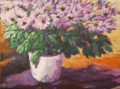
Chrysanths -Acrylic
Geoff Bennett,
Joint Winner November 2014,
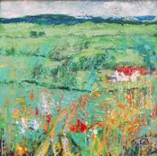
Bayfordbury - MixedMedia
June Pickard,
Critique Winner December 2014,
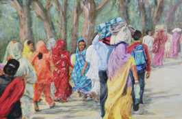
Indian Pilgrimage - Acrylic
Jill Rolfe,
Winner January 2015,
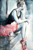
I Wonder If I Got The Part - Watercolour
Bill Dean,
Winner February 2015,
Golf Sale - Oils
Jill Rolfe,
Winner March 2015,
So Ewe - Watercolour