69th Open Exhibition - Prizewinners
Hertford Art Society 69th Open Exhibition 2022 - 30th April to 7th May
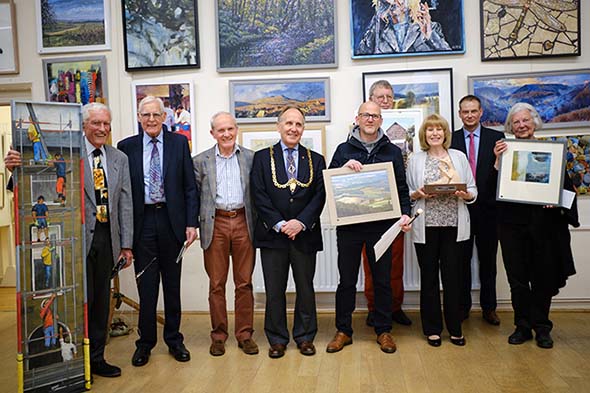
This year's Open Exhibition runs until the 7th May at Cowbridge, Cowbridge, Hertford SG14 1PG and these are the Prizewinners
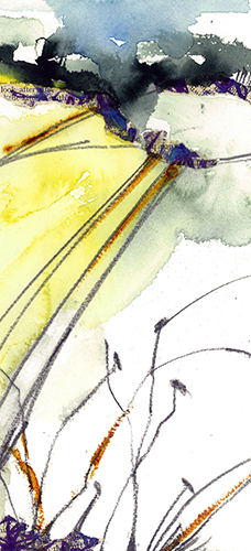
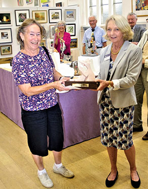
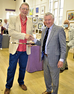
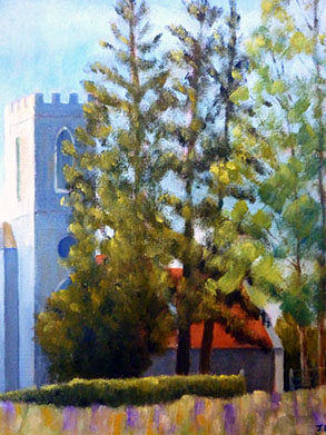
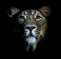
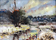
- The John Goss Prize Best in Show awarded to Craig Allan Lee for Across the Fields
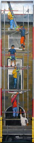
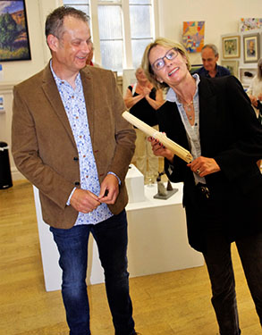
- The Bill Dale Award Best Member awarded to Geoff Bennett for Scaffolders
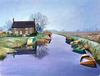
- The Edward Mason Brushes Award Best Watercolour awarded to Colin C Clarke for 'High Rise to Let' Wells-next-the-Sea
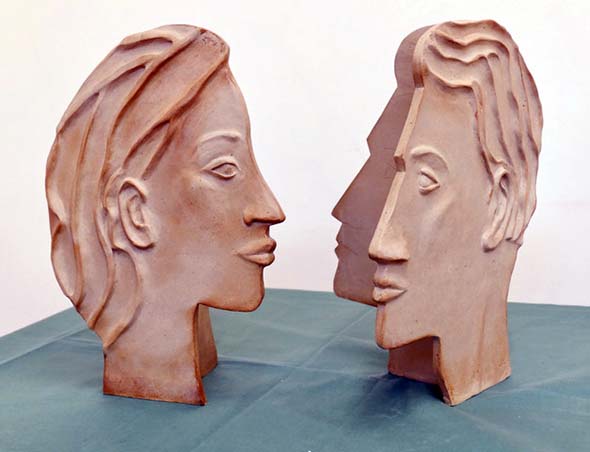
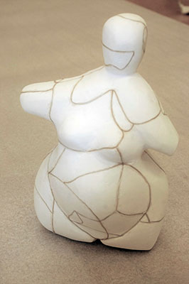
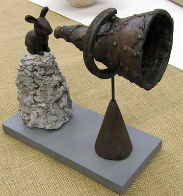
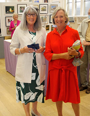
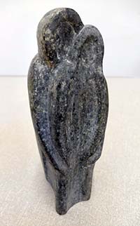
- The Mayor's Award Best 3D awarded to Kathy Burman for 'She' and 'He' jointly
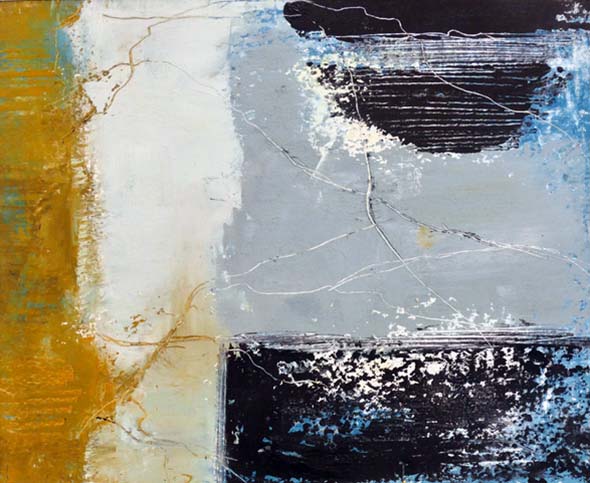
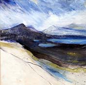
- The Lady Laming Award Best Abstract awarded to Judith Moule for Across the Reef
Three 3D works were Highly Commended:

The John Goss Prize Best in Show
Sponsored by
![]()
awarded to Craig Allan Lee for Across the Fields
The Bill Dale Award Best Member
awarded to Geoff Bennett for Scaffolders

The Edward Mason Brushes Award Best Watercolour
awarded to Colin C Clarke for 'High Rise to Let' Wells-next-the-Sea
The Mayor's Award Best 3D
awarded to Kathy Burman for 'She' and 'He' jointly
The Lady Laming Award Best Abstract
awarded to Judith Moule for Across the Reef

Highly Commended
Romeo and Juliet by June Pickard
Highly Commended
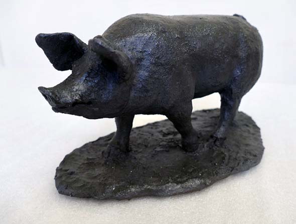
Pig by Anne Gascoigne
Highly Commended
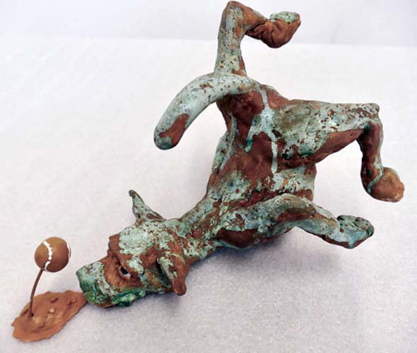
Dog Fail by Martin Bushell

Visitors's Choice Award
Queen of the Night by Tracy Pennington
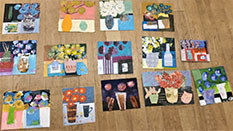
69th Annual Open Exhibition April-May 2022 - 68 images, click here to view.
For full report, click here for more details.
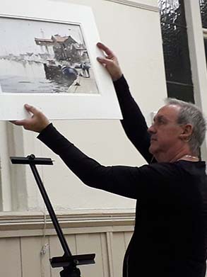
Watercolour Demonstration of Seaside Landscape by Ian Michael McManus
19th April 2022
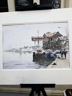
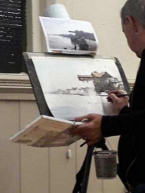
Ian Michael McManus is a Member of the Institute of East Anglian Artists and runs classes and workshops in Watercolour painting. His style is direct application of paint with no overlay of washes as he believes this gives the finished painting the quality of transparency which is so essential to watercolours. He describes himself as a “tonal” painter, working from light, through mid-tones to darks and he feels that this is more important to the success of a painting than colour.
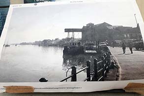
Ian had sketched a view of Wells-next-the-Sea (from his own photo) onto a sheet of 140lb Saunders Waterford Rough paper using a Faber Castell propelling pencil with a 2B/2mm lead. He does prefer Arches paper but often uses Saunders also as it is less expensive. Both are cotton rag papers with an internal size, not on the surface. The paper is taped to a board at the top only. Ian‘s advice is that taping on all sides can leave unsightly run marks – taping just at the top allows excess paint or water to run clear of the painting and stops the paper buckling. He mentioned that he always leaves the pencil sketch as he feels it adds to the finished image and also that he does not wet the paper, he feels this gives no control.
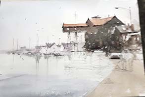
Ian begins with the lightest tones first and applies with a wash of a light grey tone over the entire sky, blending pale blue at the top. The sea is painted with a very pale grey for the distant water, gradually strengthening the mix with deeper tones of blueish grey in the foreground. He adds a warm tone for the walkway which has the effect of bringing it forward. Once the sky area is dry he paints the background across the bay in pale shades of soft brown with darker areas for roofs and boats, being careful not to add too much detail as this area needs to recede. He uses squirrel mop brushes in a range of sizes for the washes with a synthetic round No. 10 brush for detail such as masts etc. as this comes to a fine point.
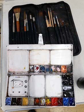
Ian uses Windsor & Newton Artist quality watercolours in tubes and a large, plastic closing palette for mixing with the colours laid out in pans. His favoured colours include: Lavender, Burnt Sienna, Burnt Umber, Yellow Ochre, Buff Tint, Light Red, Cobalt Turquoise (very useful in making greens), Sepia and Neutral Tint and Verditer Blue (similar to Cobalt Blue but more transparent).
The roof of The Granary is rendered in a warm tan colour with darker tones for the main structure and supports. Areas are allowed to blend using wet on wet technique. Ian uses a water spray before adding strong dark browns. This complex building is simplified, the paint is allowed to run and small areas are left unpainted to indicate features. Using the synthetic brush, Ian outlines the figures and the parked car and adds extra detail to the Granary. The boats alongside the quay are next painted in the strongest dark tones, in warm and cool shades. Great care is taken by Ian to leave highlights of white paper on the boats and the very dark reflections in the water surface. He is then onto the final stages of adding detail to the parked car, portraying the figures standing on the quay, panting an ochre line on the edge of the quay, two bollard and some birds in the sky. Using White Gouache he adds ropes securing the boats, a mast, highlights on the shoulders of the figures and a white bird.
Ian gave tips and hints throughout this demonstration, reminding us to find a reason to connect elements within our work to lead the eye into and around the painting. He encouraged questions and comments as the work progressed. He stressed that tone is all important and his painting illustrates this beautifully with the moored boats and figures boldly placed at centre stage. All the other elements and the subtle use of colour give the image depth and balance.
This was a very instructive and enjoyable evening and very well received. Ian was thanked for giving us such an inspiring demonstration and for his advice on how to simplify aspects of a scene in order to achieve a successful watercolour painting.
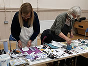
Mixed Media Semi-Abstract Workshop with Carmen Renwick
12th April 2022
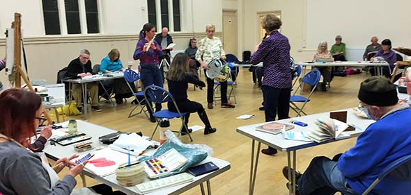
Carmen Renwick is an experienced artist and with a background in illustration & design, printmaking, painting, collage and mixed mmdia. She headed Art and Design at Swavesey Village College and taught the Arts in Special Education. She is currently enjoying working in mixed media on a larger scale. We were delighted to welcome Carmen for an experimental mixed media workshop.
We were asked to bring:
• Black or brown ink OR black and white acrylic paint
• Mark making tools – a selection of, say, sticks, string, feathers, bamboo, wood, toothbrush, scrubbing brush, old credit cards, combs, fork etc.
• Container for paint and inks so items can be dipped in to print with
• White paper - 5 sheets A4 - not too thin
• Paintbrushes, scissors, glue, water pot, masking tape
• One colour of another medium, e.g. pen, pencil or oil pastel
• A landscape photo for inspiration (e.g. something torn from a magazine)
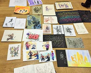
Carmen had brought along interesting extras for anyone to use, including liquid charcoal and coloured inks. She gave a fascinating talk on her background. The exercises she planned for the evening were designed to be playful, to free up the way we approach our painting or drawing. Artists (herself included) can sometimes feel in a bit of rut, repeating themes because they have become familiar rather than because they inspire. Mark making with miscellaneous bits and pieces can give intriguing results and effects and lead one in a new direction.
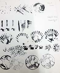
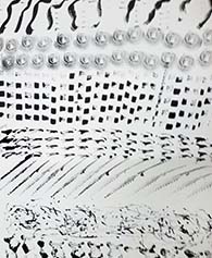
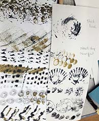
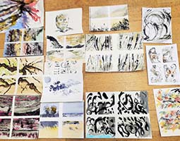
Our first task was to use ink or acrylic (in black or brown) to make a series of marks, in rows, on an A4 sheet, varying scale, using repeat patterns, random prints – anything really to make it interesting. We were asked to note alongside what had been used to make the mark. These sheets were then cut in half lengthwise and half passed to our neighbour who used this sheet for inspiration and embellishment. Some of the items made surprising and interesting marks.
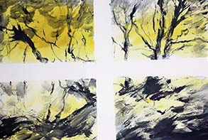
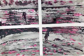
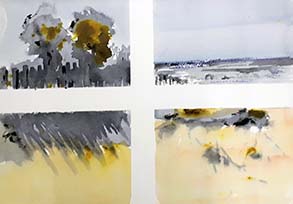
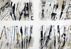
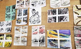
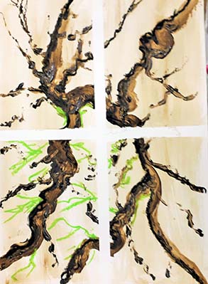
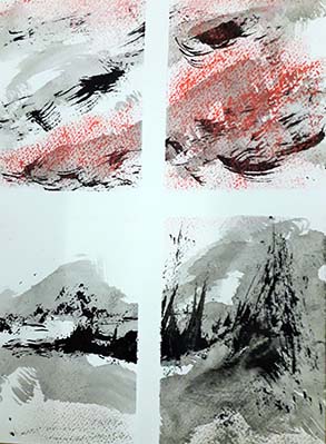
The main project involved taping across a sheet to divide it into quarters and then using inks in varying tones in a manner which worked across the entire sheet, either an actual scene or abstract shapes. Again various tools could be employed, along with brushes, gradually adding darker tones and lastly one colour to the image. Carmen gave encouragement and tips as, gradually, some very interesting paintings emerged. She felt that sometimes one of the quartet of images would give rise to a further, larger painting. They could be cut up and rearranged, collaged or form a starting point for a more abstract work. We were encouraged to go around to see how others were tackling the task and there was certainly a great variety of images. Everyone had their own approach and used their own imagination.
This was a very enjoyable workshop and was great fun. Carmen was warmly thanked for leading us along a very interesting path to, perhaps, more freedom in our artwork.
A musical evening with a klezmer group
Untutored drawing and painting workshop - 29th March 2022
We were delighted to welcome Marianne, Adina, Jo, Karen, and Rachel for an evening of klezmer music (a variety of traditional Jewish tunes originating from Eastern Europe). There was flute, clarinet, accordion, percussion, and Marianne on violin.
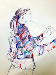
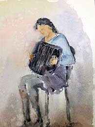
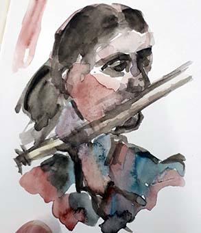
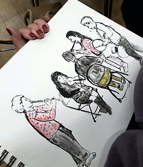
Artists were free to sketch, draw or paint in any medium of their choice. Some approached it like a clothed life drawing session, making drawings of the musicians and their instruments. Some felt like doing something rather abstract and ‘painted the music’, like Kandinsky. One Member was tempted to join in with a dance.
This was a magical evening with almost two hours of lyrical, moving music and the chance to observe, sketch, paint the musicians (and in one case to draw the music, with eyes closed!) and to just enjoy the experience. Members of the London-based Klezjammers, the musicians played from the heart. Their repertoire is tremendous - they play entirely from memory. They were thanked for sharing their music with us. It was joyous and the resulting variety of artworks full of life and movement.
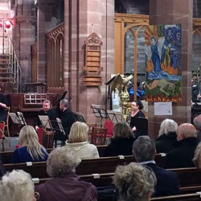
Display of painting illustrating Hertford Choral Society Spring Concert
Elgar’s “Dream of Gerontius” – 26th March 2022
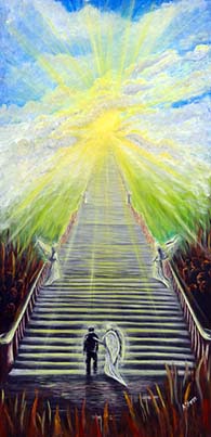
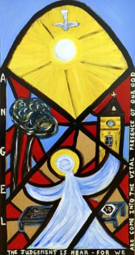
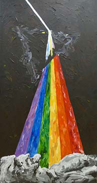
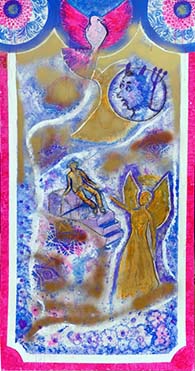
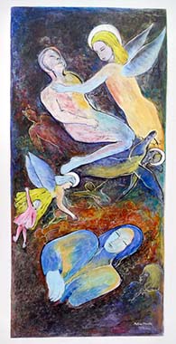
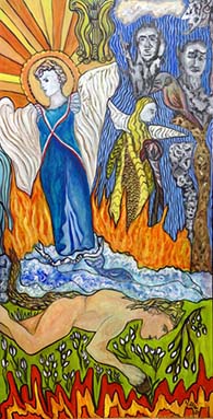
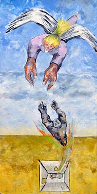
Each year Hertford Art Society illustrates Hertford Choral Society’s Spring concert with large pictures hanging from the pillars lining the central aisle of All Saints Church, Hertford, where the concert is held. This year’s challenge is Elgar’s Dream of Gerontius - the surreal journey imagined by an old man contemplating death. There’s no shortage of painterly images as Gerontius arises from his bed and is led by a guardian angel through various scenes to arrive in Purgatory.
Interpreting the scenes is not a straight-forward task. For a start it’s not Gerontius who undertakes the journey, but his soul, which is a quite different kettle of fish. How does one paint a soul? Same as a living body, or something quite different? He is guided by a guardian angel of indeterminate gender. Given the times we live this is tricky stuff for us painters. For me an angel is unquestionably a young woman - flaxen-hair streaming out behind her. Moya also sees the angel as female, but choses a curly-haired brunette entirely harmonious with the picture’s Arts and Crafts background. Persis by-passes the dilemma with an androgynous image; Alyson give us a neutral back-view.

One thing we are pretty well agreed on is that both Gerontius and his guardian angel need to be in the picture. Well, all but one of us makes this decision. Janet has chosen the dramatic image of a prism uniting the disparate colours of this world into a single pure light leading to a better place. The other characters in the libretto are optional but the pictures that work best in my view are those busy with ancillary figures – the angelicals, the souls in purgatory, and best of all, the demons - ‘hungry & wild, low born clods’. Marianne, Moya and Mitiko have all opted for a confusion of characters crowding onto their 4’ x 2’ boards, emphasising that our story is not a piece of reportage, it’s a dream where images jostle each other for a place in the action.
So plenty to chew on as we turn the words of Elgar’s choral work into visual images. The pictures can be viewed at All Saints Church from 26th March, the date of the concert where they will probably remain hanging in for a couple of weeks thereafter. See www.hertfordchoral.org.uk for details of the concert.
Hertford Art Society 23rd Members’ Show
Prizewinners
Marie Goldsmith Award for a Member with a high standard of work who has served the Art Society well without formal recognition
- The Cafe by David Stowe - Oil
Stephen Lowe Award for most intriguing work
- The Grotto by Sarah Merry - Oil
Visitors' Choice Award (donated by Art Van Go)
- The Daffodil by Fiona White - Oil
Enid Fairhead Award for best work chosen by Members
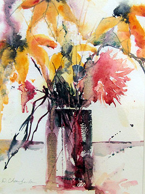
- Joint Winner - Mother and Baby Unit by Donna Chamberlain - Watercolour
- Joint Winner - Summer Fields 1 by Jill Rolfe - Watercolour
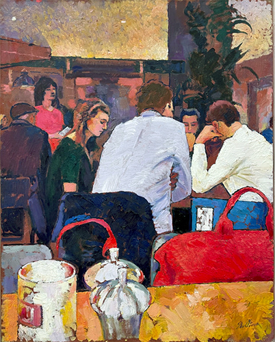
The Cafe by David Stowe - Oil
The Grotto by Sarah Merry - Oil
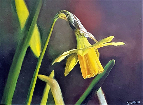
The Daffodil by Fiona White - Oil
Joint Winner - Mother and Baby Unit by Donna Chamberlain - Watercolour
Joint Winner - Summer Fields 1 by Jill Rolfe - Watercolour
23rd Members Show October 2021 - 44 images, click here to view.
For full report, click here for more details.
Hertford Art Society 68th Open Exhibition 2021
“LOVED IT! - Such a beautiful range.” “A fine collection of work. Enjoyed it enormously.” “Always love visiting this Exhibition and this year’s does not disappoint. Such a high standard. Congratulations to all involved.“ “Such talent in our locality - Thank you for a splendid show.” “As always, a diverse array of styles and artists. Most enjoyable!” “So many different artworks - a magnificent collection.” “A terrific range of great work. The variety, techniques and concepts are richly inspiring. Well done!”
We were glad that this year’s Exhibition could go ahead. The date was later than usual and the show was for a shorter duration but as can be seen from the selection of comments above, the Exhibition was very well received. A great variety of work was submitted from 94 artists and the judges selected 256 paintings, prints, collages and other 2D work for inclusion together with 30 sculptures in a range of materials and styles. It was wonderful to see visitors enjoying this colourful and diverse collection of work - many by Members of the Hertford Art Society. Two items tied for the Visitors’ Choice prize this year.
Award Winners
The prize winners this year were as follows:
- The John Goss Award for the Best in Show was awarded to Colin J Clark for 'High Rise to Let 2 Wells-Next-to-the Sea'.
- The Lady Laming Award for the best Abstract work was awarded to Rita Dare for 'Stay a While'.
- The Bill Dale Award for an outstanding work by a Member of the Society was awarded to Anne McCormack for 'Fleeting Moments'.
- Mayor's Award (sponsored by The Arts Society East Herts) for the best 3D work was awarded to Heather Jukes for 'String Woman'.
- Edward Mason Brushes award for the best Watercolour painting to Donna Chamberlain for 'Dance in the Sun'.
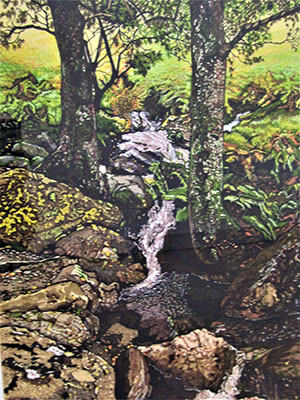
- Visitors' Choice Award to Martin Bushell for 'Important Bunny Announcement' and to Colin J. Clarke for 'The Brook'.
John Goss Award - best in show
Colin J Clark for 'High Rise to Let 2 Wells-Next-to-the Sea'.
Lady Laming - Abstract prize
Rita Dare for 'Stay a While'.
Bill Dale Award
Anne McCormack for 'Fleeting Moments'.
Mayor's Award for 3D
Heather Jukes for 'String Woman'.
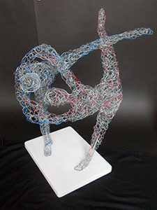
Mayor's Award for 3D
Highly Commended were
Kathy Burman for 'Dancers - Sketch 1' .
Mayor's Award for 3D
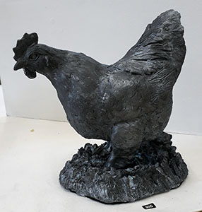
Highly Commended were Ann Gascoine for 'Hen'.
Edward Mason award
Donna Chamberlain for 'Dance in the Sun'.
Visitors' Choice Award
Important Bunny Announcement by Martin Bushell
Visitors' Choice Award
The Brook by Colin J. Clarke
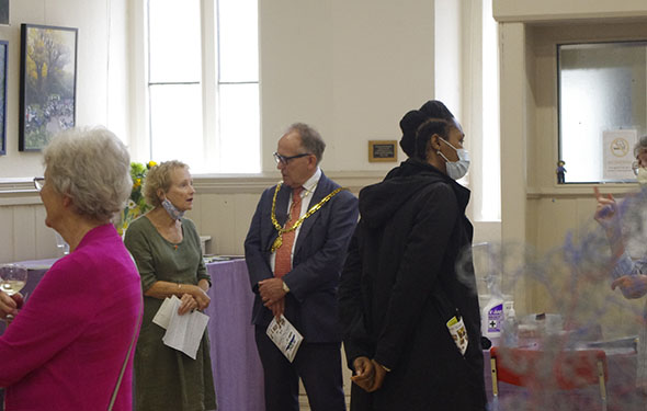
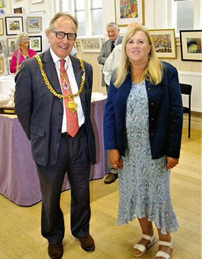
Prizegiving
Jill Rolfe with the Mayor
Left: Rita Dare presentation of The Lady Laming Award by The Mayor of Hertford Councillor Bob Deering. Right: Heather Jukes presentation of The Mayors Award by Julia Fulton from The Arts Society East Herts
Left:
Donna Chamberlain presentation of The Edward Maison Brushes Award by Craig Morton. Right: Colin J Clarke presentation of The John Goss prize by Peter Ruffles MBE.
Left:
Anne McCormack RI SWA presentation of The Bill Dale Award by Diane Dale. Right: Award winners with their pictures.
For full gallery, click here for more details.
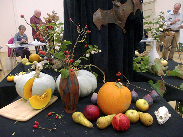
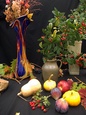
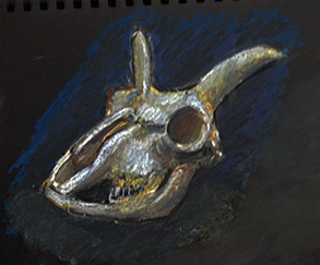
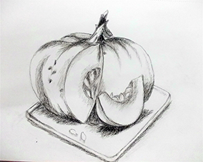
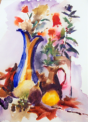
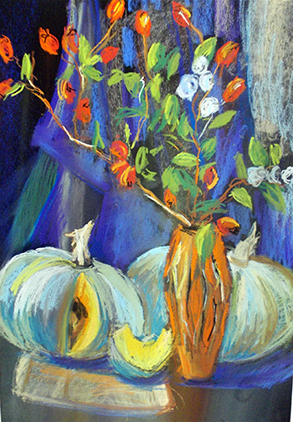
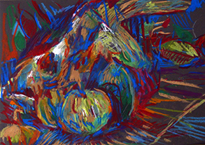
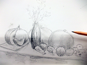
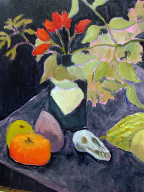
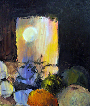
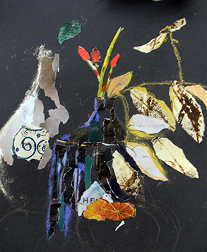
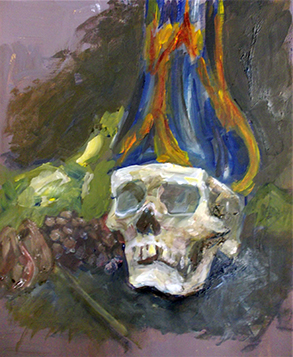
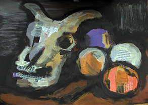
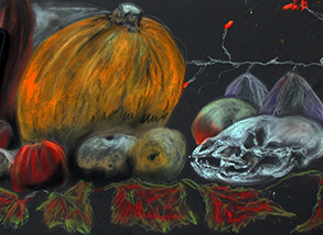
Pre-Halloween Still-life workshop
Working on black paper - 26th October 2021
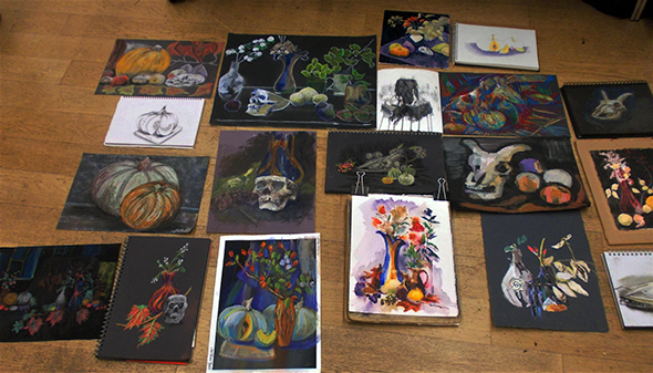
This untutored Workshop was organised by Marianne Dorn and a stunning still-life tableau was set up against a black fabric backdrop which contrasted brilliantly with bright pumpkins and autumn fruits, colourful vases, leaves and berries and, for extra drama, skulls - animal and human.
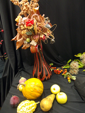
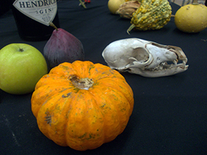
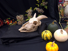
We had been encouraged to work on black paper or black supports (optional). For paints or collage, working on canvas or board prepared with a layer of black paint was suggested.
Members were free to work in any medium of their choice and these included:
- Charcoal and chalk
- Collage
- Acrylic or other opaque paint – Perhaps include black paint!
- Coloured pencil
- Pastel (soft or hard/conte)
- Oil pastel
It would be fun to experiment with other opaque craft materials to paint or print with or white & metallic pens or markers.
Working on a black ground is challenging. The image can either be built up in subtle tones or one can simply “go for it” using bright colours initially and then perhaps dialling them back with darker colours or black or grey pastel, for instance, to create form. This was an absorbing and stimulating Workshop and the resulting paintings and drawings were colourful and dynamic. This definitely an approach worth exploring further.
Marianne was thanked for organising this very interesting and enjoyable Workshop.
Still Life Workshop with Jan Munro
28th September 2021
Jan Munro is based in Hertfordshire and works in many mediums, including acrylics and pastel. She has exhibited widely, runs workshops and on-line tutorials and is a member of the Pastel Society. She remarks on her website “It's about design for me. I love combining colours, working on placement of tone, making my marks, doing what I love, I want to look beyond the reality.”
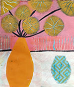
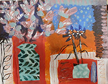
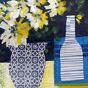
The aim of this workshop was to explore the arrangement of tones, shapes and patterns and make a simple still life from a coloured painted base and collage. The still life was imagined and the plan was to produce a still life with flowers.
Having already prepared our supports (mount board or thick paper) with gesso we were able to go straight into painting the entire surface with our chosen hue which would then ultimately be the colour of our flowers. This was followed by some random colourful or patterned pieces of collage which would become the vase and a cup. A toning or contrasting colour of paint was added to the upper part of the painting and then the paint lifted to reveal some flower shapes in the original chosen shade.
The next step was to paint into the negative spaces in order to reveal the shape of the vase and cup. It was important at this stage to carefully consider the tonal values.
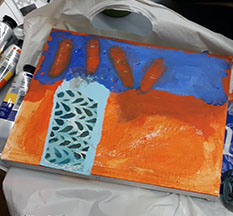
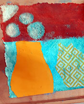
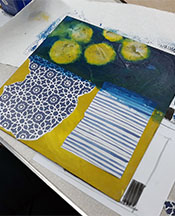
At this point it was time to stand back and consider. More collage, some scratching into the paint, refining the flower shapes, adding oil pastels, more negative painting, stencils, or splatters. All sorts of possibilities to progress with but always considering the overall tones and design.
We had a fun, messy and constructive evening. Some fabulous and incredibly varied work was produced.
A great evening and well supported. We thanked Jan for her skills and enthusiasm. She is an excellent artist and teacher.
Summer Programme 2021
Sketching and Painting at local venues
Our Society’s twelve Summer outdoor sketching evenings this year were enjoyed by Members in varying degrees. This was reflected in the weather conditions encountered, which ranged from “cold/dull” to “warm/balmy”. The Programme included venues around Hertford and Ware, the charming pond at Chapmore End and Walkern Village. The evening spent painting in Sacombe Park for instance was truly a welcome summer evening. Another such sunny evening was our visit to Haileybury College where we were kindly allowed to paint until 9pm.
On three evenings Members were invited to visit and paint in Members’ gardens and we were all appreciative of the hospitality received. On the final evening fourteen members rounded off the Summer sketching evenings with a convivial meal at the Salisbury Arms in Hertford.
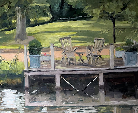
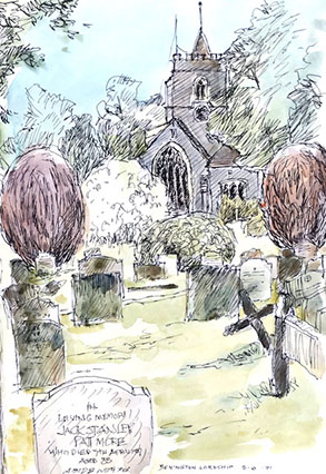
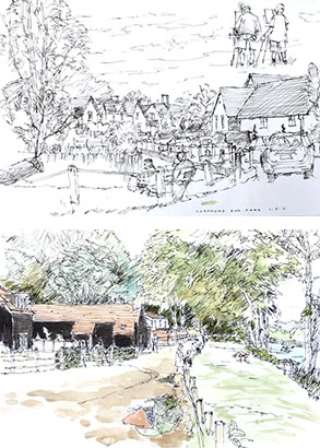
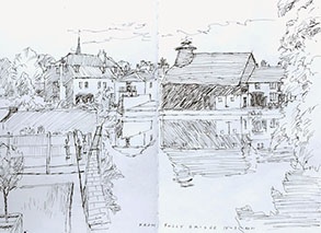
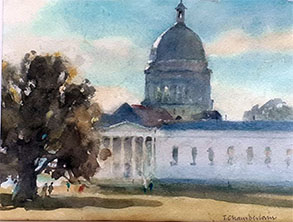
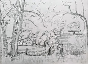
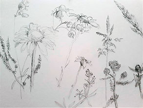
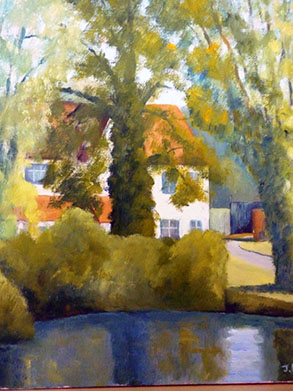
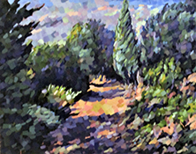
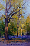
This is a selection of sketches and paintings produced by Members.
Landscapes in PanPastel - On-line Demonstration by Les Darlow
20th April 2021
Les Darlow trained as a Technical and Scientific Illustrator, and now paints expressively and creatively, producing paintings that are based on feeling, light, energy and movement. He paints in many mediums, runs extensive workshops and his book “Absolute Pastels” details his approach to this medium and contains 5 workshop projects. He has a love and passion for weather and landscapes as light and weather change the subject continuously.
Les begins the Zoom session by talking about materials and his choices of paper. Although he does work in traditional pastels (mainly Unison) he is demonstrating this evening working with PanPastels. These are supplied in small pans in various colour combinations - Landscape, Portraits, etc. They have a very fine texture, add colour to the paper without filling the grain, are semi-transparent and contain 40% more pigment then traditional pastels. They are applied with sponges of various sizes, depending on the effect required. The smaller shaped sponges are held on a sort of painting knife and can create sharp shapes and edges. These pastels can be blended with fingertips, can be drawn over with most pens etc. and it can be lifted off with a clean eraser (before fixing). PanPastel can be mixed like paint, a distinct advantage not achievable with sticks of traditional pastel and Les loves the soft effects he can create with this medium.
 The first demonstration is on light grey Pastelmat paper which Les describes as a velvety light sandpaper. He has chosen a dramatic skyscape with strong clouds and a golden light. Les positions a spare piece of card to one side to test his colour choices. He selects a square cut sponge and picks up pigment, mixing a pale yellow on the sponge. He applies this with bold, print-like marks, adding different shades of yellow and orange to give a glow to the paper. Working with shades mixed by picking up colour from two or three of the individual pans, Les gradually defines the cloud shapes varying pressure to apply delicate or stronger tones. Glimpses of blue sky add depth. The distant hills are added with a large sponge and a sweeping motion and the foreground landscape is painted with bolder, smaller shapes with some very dark tones. Less mentions that he likes to use black with red added for warmth. The image comes alive with a lake in the foreground - with highlights in traditional pastel, also used here and there for details. He achieve a crisp line using masking tape which does not disturb the pastel.
 Les chooses white Canson Mi Teintes paper for the second demonstration. This paper is 50% cotton and very responsive to PanPastels. He begins to work on the sky, smoothing pigment across the paper with a large sponge, layering so that the colours shine through, gradually adding stronger tones. This paper can withstand “scrubbing”. Using a small sponge he add hints of clouds with pale yellow light on the undersides. The distant hills are in a warm grey. This image has very strong dark tones for some dock in the distance and Les makes interesting bold marks using both pastels and pens. A traditional pastel is used to add tiny bright lights to this area. The sea is built up in the same way as the sky but with more texture and variation. The sunlight is finally added with bold strokes of traditional pastel.
Les works from light to dark, rather like watercolour and mentioned that is worth experimenting with PanPastels on watercolour paper. Canson Mi Tientes Touch is also designed for pastels and has a fine tooth. Some papers are more suitable for blending than others where bold print-like marks give the best results. He feels that PanPastels do not generally need fixing as there is so little pigment on the paper. Using PanPastels as an underlayer, with more traditional pastels for the later drawing is a method he sometimes employs. Sponges are washed after use.
The final demonstration was very simple but stunningly effective. On white paper Les applied layers of blue pigment, darker at the top. He then used various shades of warm and cool greys to define the shadow side of clouds. He cut a plastic eraser to provide a crisp edge and then began to “draw” the negative white shapes at the tops of the clouds, varying direction and using broken strokes. The sky immediately came into being. Further darks enhanced the clouds and a layer of dark trees gave perspective. More work with the eraser illustrated that masts etc. on a seascape, for instance can be easily lifted out as even the darker tones do not stain the paper.
Les was warmly thanked for this excellent demonstration, for sharing his expertise and for answering our various questions. The two different approaches, using different papers, were very interesting. Many of our Members have worked with pastels in the past. PanPastels offer a totally different way of working and an exciting way forward with this medium.
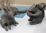
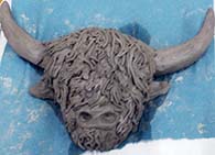
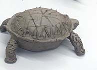
Creating a clay animal
Workshop with Abel Kesteven - 15th March 2022
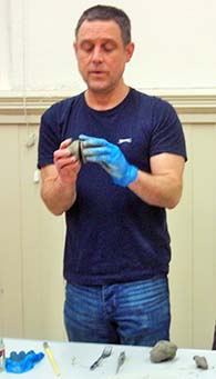
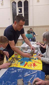
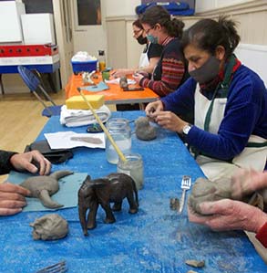
Abel Kesteven currently works in 4 different mediums. Pastel, painting/mixed media, monoprint making and sculpture, which is the topic of this Workshop. His drawing and painting is lively and he loves the challenge of drawing figures and animals in motion and trying to capture the essence of the scene in a semi abstract way. His love of animals shines through all his work and he finds using clay a very expressive medium to portray them. He exhibits and teaches extensively, focusing on therapeutic art sessions for adults with a variety of learning and health disabilities.
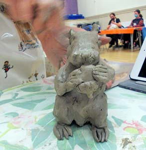
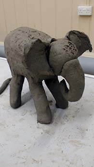
The Workshop began with a short demonstration of modelling an elephant. All of the models will require a hollow body. Taking a fist sized lump of clay Abel formed it into a ball which he then cut in half. Each half was then hollowed out into a pinch pot (sometimes called a thumb pot), literally using his thumb to gently mould the clay into two pots with even walls. The top edge of each pot was then hatched with a knife and wetted so that they could be joined to form the body of the elephant. A rolled out piece of clay was then placed in the join and, using a modelling tool, pressed and smoothed over the join. (A hole needs to be made in this hollow body to enable drying and, later, firing of the clay.)
Abel then did the same again on a “mini” scale to form the head which he attached using hatching and wetting again. The clay used can be air dried and then painted. It becomes stronger if it is possible to fire it in a kiln. He then rolled a thick coil of clay in order to cut four legs of equal size, placed the body on its back to join these on. By some miracle (the clay was very soft) the elephant stood up! Ears and a trunk completed this demonstration and Abel then handed the evening over to the, slightly hesitant, audience.
Members had brought along a photo of a creature of some sort, there was quite a range each with its own challenges. Clay was handed out and so began a series of experiments – getting the body the right shape, attaching limbs, wings, tails, having the animal or bird stand up!
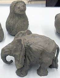
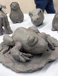
Abel passed around a couple of his own sculptures for inspiration. These were stoneware fired with subtle glazes. The otter with cubs was delightful. Abel moved around the room, giving tips, hints and praise – all of which were gratefully received as work progressed. Once the structure was in place details could be scratched into the soft surface to indicate fur or feathers. Everyone strived to give their creature some character and life. To our surprise, this actually worked and the final display of models showed extraordinary variety and some really skilful touches by artists, many of whom rarely, if ever, did any modelling in clay.
Abel was warmly thanked for encouraging and reassuring us in our efforts and for making this such a creative and enjoyable Workshop. The results were really impressive.
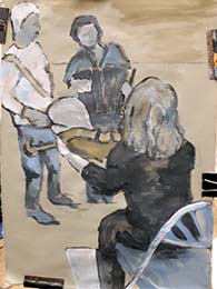
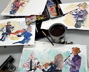
Street Scene in Acrylics Demonstration by Hashim Akib
15th February 2022
![]()
![]()
Hashim Akib started his career as an illustrator. He is an award winning artist and has published a series of books and DVDs on Acrylic painting techniques. He runs workshops and has demonstrations available to view on U-tube. Hashim is always a most popular visitor to our Society.
Hashim has prepared a canvas 24” x 30” primed with a base colour of Jenkins Green. (He always applies a base colour which can be seen, here and there, in the finished painting.) He uses Amsterdam acrylic paints (a mix of Artist and Student quality) which are set out in a large round sectional tray and a variety of large flat head brushes from the Daler Rowney Skyflow range. These brushes have a refined edge enabling fine detail to be painted with the edge of the brush.
The audience chooses an image of an outdoor café scene with strong backlighting. Hashim does no initial drawing. He begins by picking up colour from his palette with a 2½“ brush, blending colour on a mixing tray and laying down large vertical strokes of paint in a variety of light, warm tones followed by darker shades, using rich colours. At this early stage there is no definition but the tones follow those in the photograph and gradually the areas of tone and highlights begin to give form to the image. Heads are carefully placed, although indicated with a simple mark. The edge of the brush enables fine marks to be added to define figures.
Hashim feels that one should be bold and confident in exploring the practice of painting, responding to how the work makes you feel. “Avoid the literal lines” he says. He likes to experiment and his style has changed and developed over his career.
![]()
![]()
The blocks of colour form a background and areas are worked with small strokes with an 1½“ brush to bring out shapes and silhouettes of the characters. Very fine marks are achievable with the edge of the brush.
Hashim enjoys working quickly and works mostly in his studio from photographs as design is an important factor. Colour features strongly in his work and he echoes chosen colours around the painting. He adds turquoise shades to the foreground and in other areas – these show light against the rich dark tones in the background.
Marks are added to represent objects in the foreground, table edges are defined, figures become bolder. Central characters are focal points and have extra “information” added. The atmosphere in this scene is critical and was created by the colours and tones of the underpainting.
![]()
![]()
The final stage includes adding strong darks, taking decisions on what to keep and what to change, taking care with some details. He ends with white and lemon yellow highlights to add sparkle to the tops of heads, table tops and glassware. The completed painting is vibrant and lively with a gorgeous colour palette.
Throughout the demonstration Hashim shared tips and hints for creating a successful painting, entertained us with the ups and downs of his experiences and encouraged everyone to “be in the moment” and enjoy the act of painting to express our own individual response to the subjects we choose. This was an excellent demonstration and Hashim was warmly thanked for a very enjoyable and instructive evening.
Archive PROGRAMMES
Winter 2021-2022 programme
Summer 2021 programme

The John Goss Prize
for the painting considered as the Best in Show at the 69th Open Exhibition 2022
Sponsored by
![]()
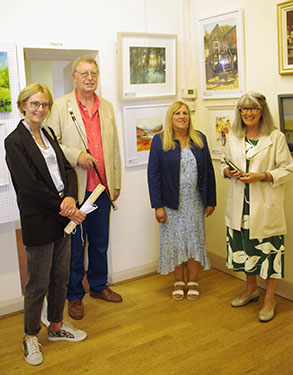
69th Open Exhibition prizewinners, 2022.

The John Goss Prize Best in Show awarded to Craig Allan Lee for Across the Fields
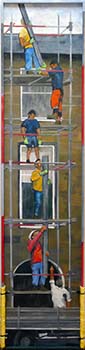
The Bill Dale Award Best Member awarded to Geoff Bennett for Scaffolders

The Edward Mason Brushes Award Best Watercolour awarded to Colin C Clarke for 'High Rise to Let' Wells-next-the-Sea
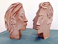
The Mayor's Award Best 3D awarded to Kathy Burman for 'She' and 'He' jointly
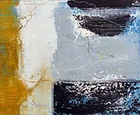
The Lady Laming Award Best Abstract awarded to Judith Moule for Across the Reef
Highly Commended - Romeo and Juliet by June Pickard
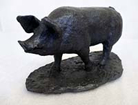
Highly Commended - Pig by Anne Gascoigne
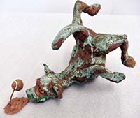
Highly Commended - Dog Fail by Martin Bushell
Visitors's Choice Award -
Queen of the Night by Tracy Pennington
Winners of Critique Sessions 2021-2022 season
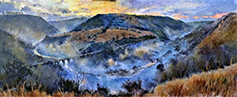
October 2021 Critique Winner, David Stowe. Monsal Dale Twilight.
October 2021 Critique runner up, Chris Hewitt. Italianate Garden.
November 2021 Winner, David Stowe. Bluebells and Sunshne.
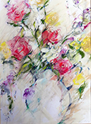
November 2021 Joint Runner Up, Jill Rolfe. Roses From My Garden.
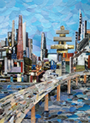
November 2021 Joint Runner Up, Kathy Burman. Urban Future 1 - Collage.
December 2021 Winner, Mitiko Murata.
December 2021 Joint Runner Up, Michael Radley, Number Nine.
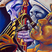
December 2021 Joint Runner Up, Sally Steele, All That Jazz.
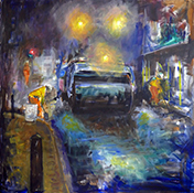
February 2022 Winner, Ray Ward, Resurfacing.
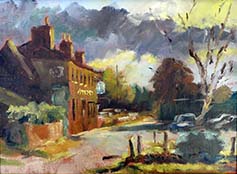
March 2022 Winner, Michael Radley, The Bakers Arms.
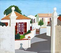
March 2022 Joint Runner Up, Jenny Stratfold, Hot Day In A French Village.
March 2022 Joint Runner Up, John Jarratt, Waiting For Spring, Norfolk.
March 2022 Joint Runner Up, Rita Dare, Lifting Light.