Chines Brush Painting
Talk and Demonstration by Sho-Jen Dowell - 23rd April 2019
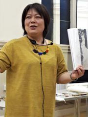
Sho-Jen Dowell is a Cambridgeshire-based artist and musician. Born in Taiwan, she has practiced Chinese Art and Calligraphy since childhood. Formally trained in fine art and commercial design, she is schooled in both Chinese and western artistic disciplines.
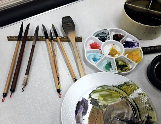
Sho-Jen introduced us to the materials which are essential for Chinese brush painting.
- Authentic ink sticks are made from pine soot and have fragrances added, often musk or sandalwood, which give a calming atmosphere when the ink stick is ground into paste. She advised avoiding cheap, poor quality ink sticks as using the best materials is very important. Ink can also be found in liquid form although this seems to conflict with the key process of grinding the ink, an essential starting point in the meditative nature of Chinese art.
- An ink stone for grinding the ink stick with water to make a paste. Again man- made materials are no match for genuine stone.
- Chinese brush painting watercolours - recommended Holbein tubes or a Japanese watercolour paint palette. Again Sho-Jen advised against inexpensive “Chinese brush painting” sets as they will be poor quality. Artist’s quality watercolours will give much better results.
- Brushes: traditionally made from many types of animal hair, each of which has its own properties. Weasel hair is typical as it holds lots of water whereas wild horse hair is valued for its stiffness. Bamboo or horn are favoured for the stem and there is generally a hook at the end of the stem so that the brushes can be hung on a rack. All the brushes in her kit came to beautiful fine points.
- Papers: “Rice paper” which is mostly not made from rice but from different plant fibres including cotton. Hand-made papers are becoming rarer but machine made papers are very acceptable. Papers can be very thin and delicate. These can be sized or unsized, cold or hot pressed - like watercolour paper. Hot pressed paper is recommended for use when many layers of paint are applied. This type of painting is called “meticulous”. “Freehand” style involves fewer layers of paint and unsized or semi-sized papers are fine for this work.
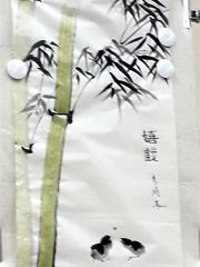
Sho-Jen had set up a metal white-board on an easel as her support. This was covered with a sheet of soft felt (essential behind the very thin paper) and paper attached with moveable magnets. Her first demonstration was of bamboo stalks and leaves and she laid broad vertical strokes, from the bottom of the paper to the top in varying shade of olive green. Her use of the brush was bold and precise. A fine brush (used for calligraphy) indicated the feathery leaf supports and leaves were then added in bold tapering strokes. Sho-Jen described the strokes as “dancing” and drew our attention to the way the brush was held, gently, rather like a pen, allowing free movement. Further leaves were added in varying tones to add variety and recession. She then painted two little birds with just a few deft strokes and completed the painting with some calligraphy and her own seal, applied in red ink. (These stamps are very important and are individually hand carved.)
Calligraphy is one of Sho-Jen’s skills and she talked about the influence of Chinese calligraphy on all aspects of Chinese art as well as architecture. It was interesting to see the connections, particularly when she did a quick sketch of a typical Chinese roofline - horizontal with upward flicks at the ends - and compared it to some Chinese characters, which she described as pictoric.
Displaying finished work can pose problems as it is so delicate. Specialist framers need to be used. The paper can be attached, before working, by pasting with wallpaper paste to mountboard. A delicate and tricky task. Sometimes the work on paper can be suspended by attaching the top to a bamboo rod or similar.
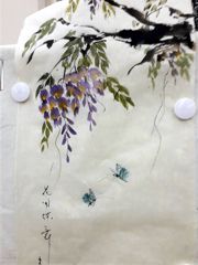
Wisteria was the subject of the second demonstration and Sho-Jen began with black ink and a horsehair brush to make “stiff” marks for the branches. Flowers were then created with varying shades of purple, the strokes gently applied in pairs to give just the right shape to the individual flowers. Gold centres were added to the flowers and some emerging eaves. The effect was delicate and Sho-Jen talked about the fact that Chines art is quite philosophical - the preparation of fine materials, the careful choice of subject, methodical application of paint and the preference for large areas of unpainted paper which are important and expressive. Each painting tells a story and Sho-Jen finished the story of the wisteria by adding two dainty blue butterflies to the work.
Chinese brush painting was an unusual and intriguing subject. Sho-Jen was thanked for sharing her expertise on the techniques and materials she uses in her work and for giving us an insight into the history and philosophy of this art form. It was a delightful evening.
Kathy Burman
Pictures at a Concert
Verdi’s Requiem at All Saints Church Hertford - 30th March 2019
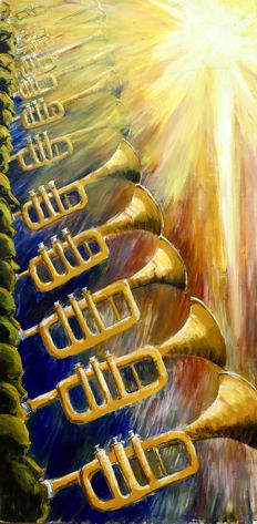
Each year the Society is invited to paint seven large pictures to hang in All Saints church, Hertford to illustrate Hertford Choral Society’s Spring concert. The concert is a very grand affair – a choir 120 strong, an orchestra of 50 professionals, four brilliant soloists and the conductor, Derek Harrison. The performance this year was Verdi’s Requiem, a dramatic piece requiring an augmented brass ensemble and a specially large ‘Verdi drum’ to give full value to the musical score.
Janet Dobney |
Brenda Thompson |
John Jarratt |
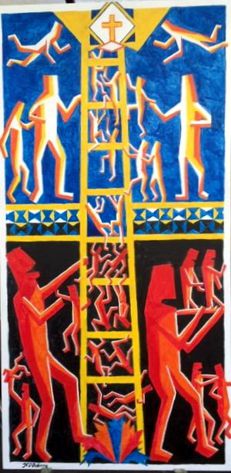
Jenny Stratfold |
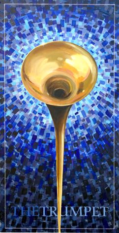
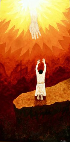
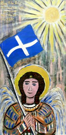
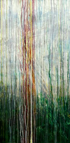
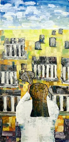
The libretto quotes ‘the trumpet, scattering a marvellous sound’ and it was this text that inspired paintings by John Jarratt, Brenda Thompson and Geoff Bennett. Persis Limbuwala fastened onto ‘May the holy standard-bearer Michael show them the holy light’, Jenny Stratford pictured a praying figure ‘suppliant and kneeling with a heart contrite as ashes’, and Janet Dobney picked up on the theme of figures climbing from the depths into eternal light. Chris Pantry, the one newcomer to our team of concert painters, opted to listen to the music rather than peruse the words. He imagined things rising upwards, heading towards a destination. As the music progressed he turned his painting upside down, to allow the paint to run down, so that the final effect would be of a medium defying gravity and normal conventions.
Persis Limbuwala |
Chris Pantry |
Geoff Bennett |
Rehearsal |
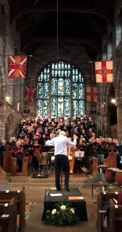
The seven pictures hanging down the central aisle of All Saints Church as Verdi's music burst out looked splendid – a testimony to the strong links between the Hertford Arts and Choral societies.
Movement in Art
Workshop with Abel Kesteven - 26th March 2019
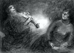
Arriving at the Cowbridge Hall for this workshop, artists were greeted by an unusual and harmonious sound - members of Kleztopia warming up for a practice session. This was a departure from their usual get-togethers as they were to be sketched and painted throughout the evening while playing.
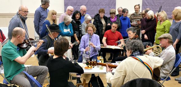
Kleztopia perform traditional music from Eastern Europe and artist Marianne Dorn plays the violin in the group. Other members of the ensemble played guitar, bouzouki, clarinet and trumpet.
The workshop was led by Abel Kesteven, an artist and sculptor who focuses, in his art, on interpreting movement and capturing the interaction between people. He often works in pastel, which he enjoys as it lends itself to quick "action" sketches.
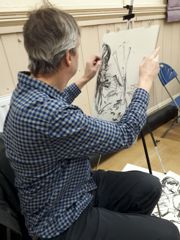
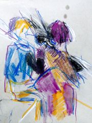
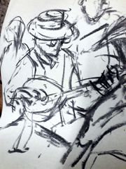
The workshop began with a series of 5 minute sketches (changing the chosen medium each time) - first using black and white only, perhaps charcoal and chalk (preferably on mid-toned paper), then a line drawing trying to look at the performers and not the paper, then a sketch endeavouring to draw without lifting pen from paper. Abel encouraged us to draw freely, observing the musicians carefully, to start at one point and see where the sketch led.
The atmosphere in the hall was calm and relaxed with everyone enjoying the music and the challenge of drawing the moving figures. Some of the movement was quite subtle, some swift and difficult to follow.
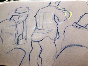
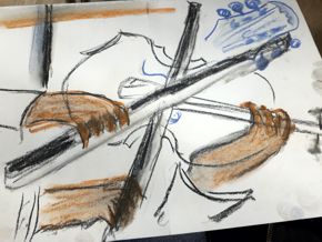
A further series of sketches focused on hand movements - careful observation paired with swift drawing to try to capture the skill and dexterity of the musicians. Later in the evening time was allocated to more detailed drawings (or paintings).
Abel gave a couple of demonstrations during the course of the evening, using line, shading and bold colours to illustrate his own manner of working.
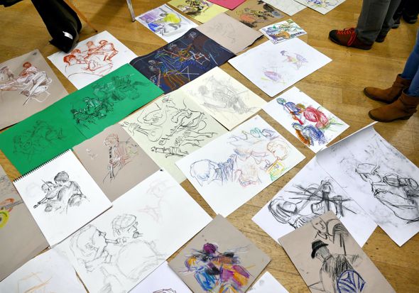
Throughout the evening Abel circulated, offering guidance on technique to each artist and leading us to try new approaches (there were over 30 of us so this was no mean feat). His cheerful encouragement together with the lively and esoteric variety of music made this a very enjoyable and memorable evening. A huge variety of drawings and sketches were produced and these were laid out at the end of the session. Some were photographed by members of Kleztopia to be used in their publicity and it was agreed that many had stepped up to the challenge of capturing movement.
The musicians were applauded and thanked for sharing their practice session with us as was Abel for running such a productive and exciting workshop.
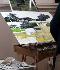
Garden Landscape - 20th November 2018
Acrylic painting demonstration by Kit Leese
Kit Leese is a professional artist who has been painting and selling his work for the last 40 years. He has always had a passion for landscape and likes to paint on the spot, often in East Anglia where catching the immediacy of changing light across the landscape is key.
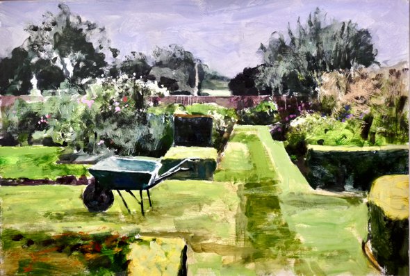
Painting a garden is a major challenge – lots & lots of ‘stuff’, most of it green with some unpleasant brown. The challenge of demonstrating how one might tackle this was taken up by Kit who paints in a number of mediums but prefers watercolour, acrylics or gouache. For acrylics he works on primed hardboard or mount board. Kit came with a photograph of a complicated garden and a prepared board on which he had sketched the main elements. He started by very loosely blocking in the main structures using a large brush and a very watery mid-tone mix of Viridian Green and Alizarin Crimson, plus some Payne’s Grey for the very dark patches. At this stage he is not too concerned with colour accuracy, but concentrates on getting the tones and the drawing right.
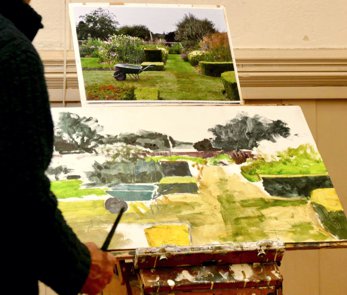
Having covered most of the area with paint he used the blade of a Stanley knife to scrape back some of it to get some light back in and liven up the picture. Diluting the acrylic with plenty of water enabled Kit to remove random bits of paint off with kitchen paper where he wanted sporadically lighter areas. For the sky he painted in diluted Cobalt Blue and ‘something pink’, then added a watery Zinc White to get a wet-on-wet watercolour effect. Kit explained the difference between Zinc White (very transparent, used to lighten the background colour without changing it) and Titanium White (a permanent white with a more drastic effect, washing out the underlying colour). At this stage Kit intensifies the darkest and lightest areas for greater contrast.
To create a variegated floral effect Kit pasted some paint on a scrap of paper, tested its tone on another scrap, then daubed appropriate parts of the painting; to streak up a solid area of paint he used the edge of his (large) brush, and some blade scraping.
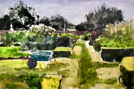
The final touches were to use a light (Sap) green across several places on the picture to unify the colour scheme, and then to dab in flower heads. The result of the evening was a very loose, relaxed and coherent painting of a Garden Landscape. This was a very enjoyable demonstration and Kit was thanked for sharing his ideas and his very personal approach to painting in acrylics.
Remembrance Sunday - 11th November 2018
Display of paintings in All Saints Church, Hertford
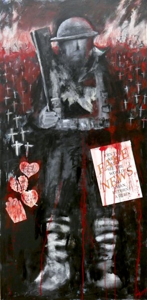
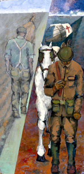
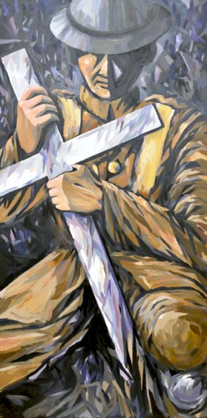 Christian Soldier - Chris Hewitt |
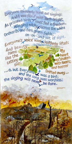 Everyone's voice was suddenly lifted; And beauty came like the setting sun: My heart was shaken with tears; and horror Drifted away ... (Siegfried Sassoon) - John Jarratt |
The Vicar of All Saints Church, Jo Loveridge, asked the Art Society if artists would provide large aisle paintings to commemorate the hundredth anniversary of the signing of the armistice. A chance to paint & display large, dramatic pictures? Well, of course we would.
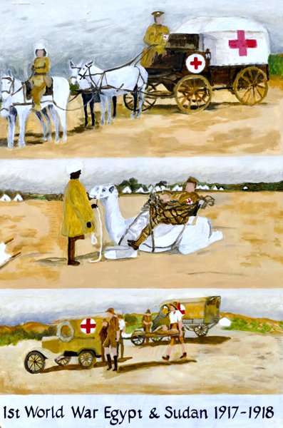
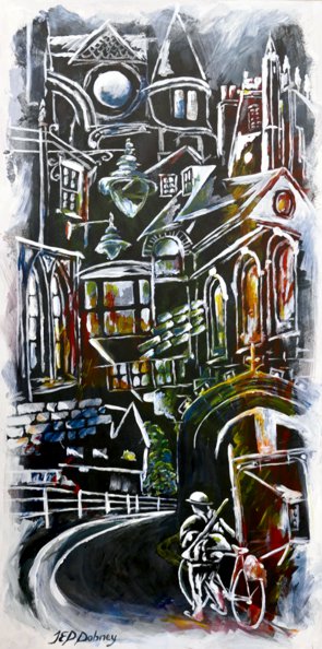
The result was seven very different images – three were figurative (Chris Hewitt’s Christian Soldier, Gillian Harman’s scenes from the war in Egypt and Sudan, Geoff Bennett’s despondent ploughman); one – John Jarrratt’s ‘Everyone's voice was suddenly lifted’ - was largely textual; and three combined figurative and symbolic images (Janet Dobney’s Hertford Lad, a soldier returning to scenes from Hertford, Persis Limbuwala’s biplanes flying over text and poppies, Janet Benge’s wry reference to WW1 Propaganda).
The overall effect of the seven pictures hanging down the central aisle of All Saints Church gave a varied representation of the Great War. The Vicar felt that these heartfelt images would be very well received during the service. They will remain on display for a further 3 weeks.
In memory of my grandfather William Angus 1884 -1919
In 1917 & 1918 he served in the Royal Army Medical Corps in Egypt as A.D.M.S. (Sanitation), 1st Echelon with the rank of Lieutenant – Colonel. I have a good collection of his photographs from this time, showing rarely seen views of WW1 in the Middle East, and have used some to create my picture. - Gillian Harman
[Left] Untitled - Janet Benge. [Right]
Hertford lad - Janet Dobney.
 No more the ploughman turns the turf Exploding shells now churn the earth. He gathers up their bitter harvest. And dreams of home. - Geoff Bennett |
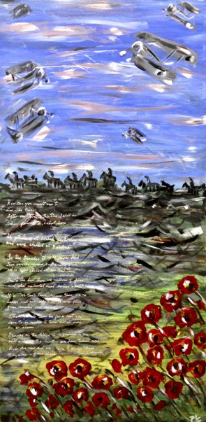 “Standing on the ridge it is possible to see what a lot of the country we have taken now." (from a letter home) - Persis Limbuwala |
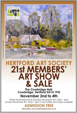
Review of 21st Members’ Show
2nd - 4th November 2018
The 21st Members' Show took place in the well lit and spacious Cowbridge Hall in Hertford from 2nd to 4th November 2018. Two hundred framed artworks, submitted by 58 Members, were on show and browsers were full of unframed work. Thirty five pieces of work were sold as well as a good number of artists' greetings cards.
The range of subjects and styles made this a truly enjoyable show to visit, with something for everyone and prices to suit all. The Children's Quiz was appreciated by children and parents alike and, as usual, tea and coffee and cake were a popular attraction. Although Friday was a quiet day for visitors, the weekend was particularly busy.
Everyone who visits and revisits the show has their favourites. The problem is choosing which one to vote for! Particularly popular among the visitors were the following: 'Nose in the Air' (camel) by Donna Chamberlain; 'Quinbury in Winter' by Sandra Edney-Lynch; 'Ladies at Ascot' by Jill Elliott; ' Rose and Cow Parsley' by Stella Green; 'Tufty' (squirrel) and also 'Alpes-Maritimes' by Pete Kelly; 'Gazebos, Ware' by Chris King; 'South Devon, plein air' by Craig Lee; 'Strolling in the Sun' by Linda Radford; 'Lion No.1' by Alyson Sharpe; 'A Sunny View' by Paul Swinge and 'Panshanger Country Park' by Fiona White.
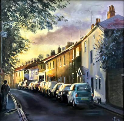
The winner of the Visitors' Choice Award was Chris Baker with 'Port Vale Sunset'. This was a beautifully lit portrait of a much-loved street.
Voting for the Members' Choice Award (now known as the Enid Fairhead Award) was very evenly split across the whole show. I would encourage all Members who attend the show to take a moment to vote, as your vote could really swing the result!
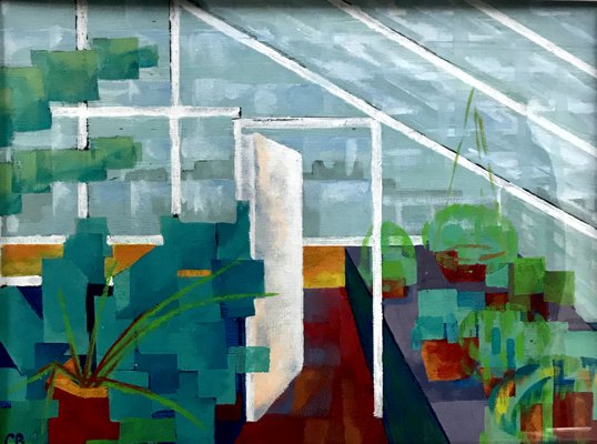
The winner of the Enid Fairhead Award was Geoff Bennett with 'Myddelton House Greenhouse 3'. This third study of a greenhouse was a very attractive abstraction of the subject which was still readily identifiable.
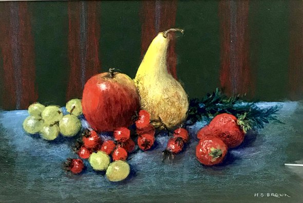
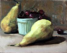
The May Bennett Award for Still Life was awarded to Heather Brown with 'Fruit and Berries', a beautiful study in gouache with glowing colours.
The winner of the Mark Ely Award for most innovative/intriguing work was Chris Hewitt with 'Washington Square, New York'. This impressionist painting looked almost as though viewed through the raindrops on the window of a yellow taxi cab!
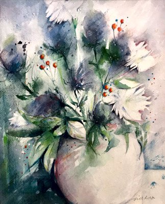
The Marie Goldsmith Award (for a member with a consistently high standard of work who has served the art society well without formal recognition of their work or service) was awarded to Jill Rolfe with 'Sea Holly'. This painting is a watercolour study with a wonderful light touch.
The Visitors' Choice Award:
'Port Vale, Sunset' by Chris Baker - Oils.
The Members' Choice Award:
'Myddleton House, Greenhouse 3' by Geoff Bennett - Acrylic.
The May Bennett Annual Award for the best still life:
'Fruit & Berries' by Heather Brown - Gouache.
The Most Intriguing Work Award, selected by Mark Ely:
'Washington Square, New York' by Chris Hewitt - Acrylic.
The Marie Goldsmith Annual Award:
'Rainy Day' by Jill Rolfe - Watercolour.
This is a show which is much appreciated by visitors, who comment on the high standard of work and the variety. It is an important showcase for the talents of the Members of Hertford Art Society (some of whom only show their work here) and it frequently brings in new Members. It would not be possible without the work of the Members, whether in setting up or dismantling the show, assisting with the hand-in, hanging or hand-back of artists' work, serving teas or stewarding. Thank you to all those who helped this year.
Frances Stevenson, Show Coordinator
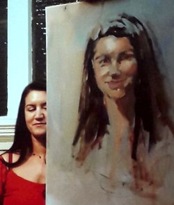
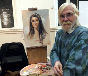
Portrait in Oils Demonstration - by Rob Wareing
16th October 2018
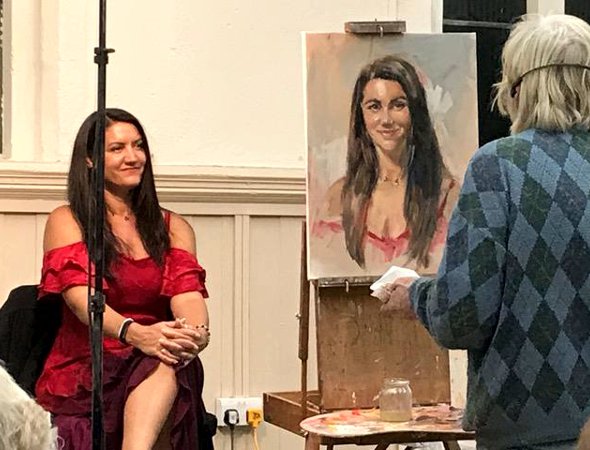
Rob Wareing was born and grew up in South Africa and still spends a great deal of time there. He studied the techniques of traditional classical painting and became a professional portrait painter at the age of 23. Since then he has had a very fulfilling career spanning over 40 years. He has painted numerous portraits of people of all nationalities and travelled extensively. His work is regularly featured in art magazines. He runs workshops, has demonstrated (on TV and YouTube) and published DVDs of his tutorials.
We are delighted to welcome Rob and his model, Amanda Allen, for this demonstration. He has prepared a canvas, painted in muted shades of acrylic - a typical background to his portraits. His first step is to sketch the model lightly in charcoal, indicating the features and measuring the distances from hairline to eyebrow, eyebrow to mouth, mouth to chin. This initial drawing is critical. He measures and plots the relationships of the model’s features, sketches in the hair, the curve of the cheek and roughly indicates her clothes. The eyes are boldly drawn followed by the nose and the lips. He remarks that the drawing will alter as the painting progresses. He then sprays the sketch to prevent the charcoal mixing too much with the paint.
Rob mixes Burnt Sienna and Ultramarine Blue to achieve a rich, almost black, shade. This he thins with a varnish and turps mixture and boldly establishes the “dark notes”- the hair, eyebrows and eyes. Beginning with the dark hair gives him something to compare the other tones with as the work progresses. Burnt Sienna and Alizarin Crimson is mixed with white to varying degrees to apply mid tones and the highlighted areas of forehead, cheeks and chin. He then uses Cadmium Red and Burnt Sienna (or Yellow Ochre) , again in mixtures with white as he works around the face, placing bold strokes of colour and often smudging with his finger. He uses a variety of brush sizes as he works. Rob changes to a small brush in order to re-draw features in darker paint, re-measuring the distances between the eyes and using a plumb line for the verticals. He adds the whites of the eyes which really starts to bring the portrait to life. He defines the eyelids with small touches of paint. It seems that he likes to get some finishing touches in early, almost completing an element before moving on.
When he is working, he likes to complete a painting in one sitting to get a spontaneous effect. He remarked that “a much better likeness but a much worse painting can be the result of too much fiddling”. He tries not to emphasise areas which are unimportant. He always uses life models, only occasionally resorting to photographs to complete a portrait if times runs out.
Rob now has many colours and shades on his palette and he works around the painting adding highlights, mid tones and darker shades, trying not to mix into the underlying paint, avoiding it becoming “muddy”. Strong brushstrokes are an important aspect of Rob’s work so he aims not to disturb them too much.
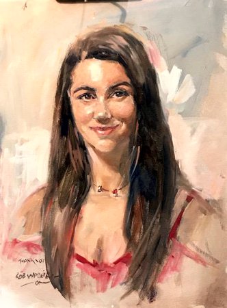
Having worked extensively on the face, Rob adds a variety of tones to the long dark hair. The model is lit with a spotlight, which really helps him to show the highlights on brow, nose, cheek and chin. Broad strokes of a light shade are applied behind the right side of the head which really brings it forward when set against the dark hair. Rob’s portraits seem to blend into the background in a soft manner with the clothes rendered in loose strokes. The model’s gorgeous red dress, which complements her complexion and rich dark hair, is finally indicated and some light tones added to shoulder and chest. Amanda was delighted to be presented with the portrait at the end of the session.
This demonstration gave a vivid insight into Rob’s techniques and approach to portrait painting. To be able to bring this portrait to life in such a short time was remarkable. Rob was warmly thanked for giving us such an enjoyable evening and for sharing his hints and tips along the way.
2018-2019 Critique Winners
Critique winners of the 2018 – 2019 season as chosen by Members
 Chris Baker February 2018 Sun & Ice - Oil |
 Craig Lee March 2018 - Joint Winner Summer Fruits - Oil |
 Celia Sanders March 2018 - Joint Winner Bamford, Hope Valley - Pastel |
 Craig Lee May 2018 - Winner A Father's Gift - Oil |
 Jean Halford May 2018 - Runner Up Reflections - Oil |
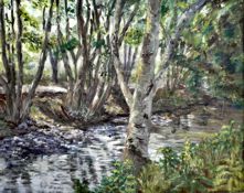 June Pickard April 2018 - Joint Winner Woodland Stream - Oil |
 Linda Radford April 2018 - Joint Winner Taomina, Sicily - Watercolour |
 Craig Lee September 2018 Cambridge, An Early Summer Afternoon - Oil |
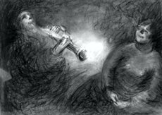
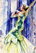 Jill Rolfe October 2018 Joint Winner Dancer In Green - MM |
 Marianne Dorn October 2018 Joint Winner Music - Charcoal |
 Craig Lee October 2018 Joint Winner Amelia - Oil |
 Celia Sanders November 2018 Winner BramfieldWoods - Pastel |
 June Pickard December 2018 Winner All Together Now! - Acrylic |
 Jill Rolfe January 2019 Winner Cocky Locky - Mixed Media |
 Ray Ward February 2019 Winner Portrait Study At Mall Gallery - Oil |
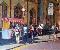
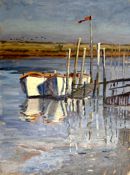 Emma Perring March 2019 Winner Two boats and a flag, Morston - Oil |
Summer Sketching & Painting Evenings 2018
Phew, what a scorcher!
That expression describes simply the wonderful weather we have experienced for our outdoor sketching evenings this summer, which was in complete contrast to last year’s cold and dull Tuesdays. For over 25 years now I have organised the Hertford Art Society’s Summer Programme and do not recall better conditions.
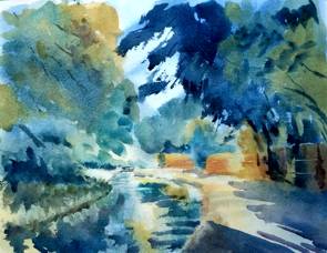
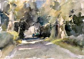
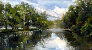
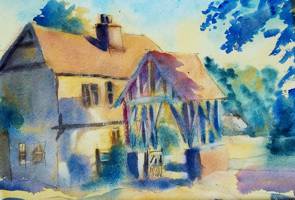
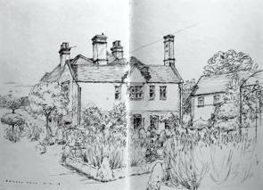
For the start of the Art Society’s Summer Programme we met around the Port Hill area of Hertford, followed by a Tuesday evening at Dobb’s Weir then another at Chapmore End Pond. The weekend at Blakeney in early June was thoroughly enjoyed by those attending with good work produced.
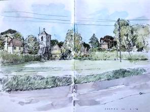 Cedars Park was the next sketching destination. On 3rd July, after two years of being thwarted by bad weather, Members enjoyed a truly delightful summer evening at Panshanger Park, with a welcome from Murray Brown of the Herts and Middlesex Wildlife Trust. The Tuesday following was at Wheathampstead village, followed at the weekend by a memorable visit to the Henry Moore Foundation. Four more fine evenings were spent at Great Amwell, Carnwell Farm, Braughing and Ware, although at Ware we did endure a light shower, as if to remind us that we live in England.
The last evening in mid-August saw 23 Members painting around Hertford Town prior to having a convivial meal at the Salisbury Arms.
This was truly a summer to remember.
Comments by Persis Limbuwala
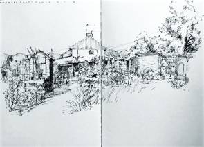
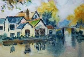
[Left] This picture was started at Braughing Village and finished at home with the aid of photographs taken on the spot that evening. These three completely different buildings appeared to compliment this corner situation so typical of an English village over a long period of time. Buildings from different centuries seem to look like good neighbours and that was what attracted me to choose this location from all the other wonderful locations within this friendly village. I completed the basic sketch in situ and applied the first coat over each area and then waited for it all to dry - bringing it home to finish with several layers of watercolour paints.
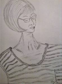
[Right] This rough sketch is of a friend of mine who I invited to join our group on a practice summer evening and being local we met at the Ware riverside but the heavens decided to rain on us so we ended up in the pub where we were due to meet up eventually and in order to do some art work that evening we decided to sketch each other across the table and this was the result of my effort on that summer outing with our HAS group.
Comments from Craig Lee
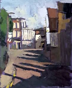
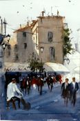
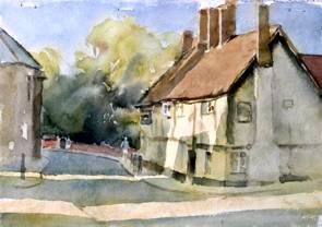
[Left] Cowbridge Hertford. This was from my first evening painting with HAS this summer and was surprisingly chilly. What caught my attention here was the long shadows typical of early evening. Painted with oils on panel 12x10 palette knife.
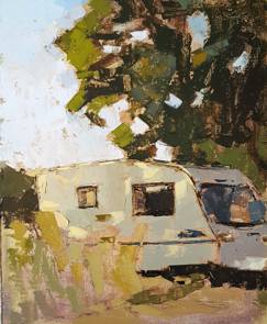
[Right] The Caravan. The diversity in an individual's choice of subject matter when in the same place always fascinates me. On this occasion I believe I was the only person drawn in by this caravan and the last dappled rays of the evening's light. Oil on panel 12x10 palette knife
Trevor Chamberlain
Wildlife in Acrylics
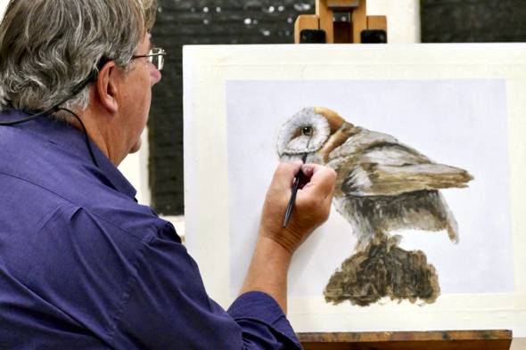
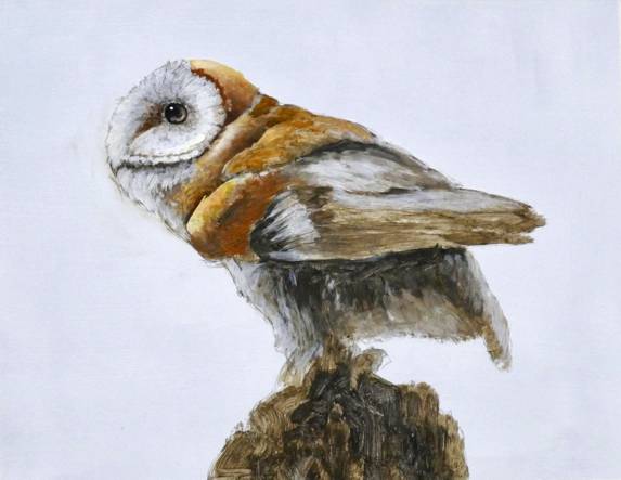
Demonstration by David Hyde - 18th September 2018
David Hyde is a self-taught professional artist who lives and works close to the river Great Ouse in St. Ives, Cambridgeshire. He has combined a keen interest in wildlife and bird watching with a life-long passion for painting.
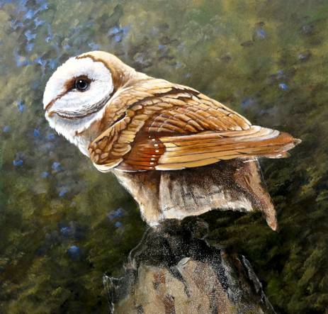
Having worked mainly in watercolour, David has, over time, developed a technique in acrylics to suit his style of portraying wildlife. He works mainly from photographs and had chosen an image of a barn owl against a dark background for his demonstration. He favours MDF board as a support, primed with several layers of Liquitex gesso on both sides and then sanded to a smooth finish as fine brushwork and detail is needed for wildlife painting. (He uses a board cut to the size of his framed painting with the area for painting masked around. The process of adding a mount and framing is thus simplified.) He favours Liquitex Soft Body acrylics as they can be applied thinly, rather like watercolour, without loss of colour. He uses a Liquitex medium to thin the paint and normally paints standing with the work on a tilted board.
David had prepared a sketch from the photograph and using a mix of Raw Umber and Paynes Grey he painted onto his sketch using a fairly large brush and light directional strokes to indicate the groups of feathers. He left this layer to dry so that further paint did not disturb the under layer. Acrylic can be used in countless layers as long as the surface is dry and he uses this technique to “build” the image, taking note of the underpainting and leaving some areas uncovered by further paint. Using a dark mix he blocked in the eye and shadows under the wing to give the bird character and form at this early stage, using a wetted finger to blend. He began to paint white feathers around the face using thinned gesso, following the direction of growth. As it is diluted the colour fades as it dries giving the feathers a soft appearance. The dark underpainting forms the gaps between feathers and separates the feather groups. David then added another layer of white for extra texture observing the direction and turning the board for ease. He floated a dark wash around the eye socket and added a light area to the iris of the eye to give life to the image. He defined the mask of the face by adding shadow below, blending with a damp brush. He created form and texture to the face area with a small brush, refining the image with Titanium White to highlight and lift the edges of the feathers around the face.
The Old Masters used the technique of underpainting, laying in the form and adding glazes of colour as the work progressed. David feels this technique works well with wildlife painting. He next used Cobalt Blue mixed with Burnt Sienna and Liquitex Gloss Medium as a glaze on the darker areas, allowing the underpainting to remain sharp. Opaque colour was added to the top of the head, a warm ochre, lightened at the top of the head with white, blended with feathery strokes into a rich red in the shadows. He prefers Galeria brushes by Windsor and Newton for these details. They hold their shape, come to a point and are quite robust.
David’s process is one of building up the form by adding darks and lights gradually with the underpainting showing through a little, thus giving depth and form to the image. At the end of the demonstration the painting was well under way and will be completed later, the dark background adding drama.
This was an absorbing demonstration, the owl gradually coming to life though the careful and skilful application of layer upon layer of paint, with David generously sharing his knowledge and insights into the process he has developed. David was warmly thanked for making the evening so interesting and enjoyable.
Archive PROGRAMMES
Winter 2018-2019 programme
Summer 2018 programme
Winners of Critique Sessions 2018-2019 season
Chris Baker,
February 2018,
Sun & Ice - Oil.
Craig Lee,
March 2018 - Joint Winner,
Summer Fruits - Oil.

Celia Sanders,
March 2018 - Joint Winner,
Bamford, Hope Valley - Pastel.
Craig Lee,
May 2018 -
Winner,
A Father's Gift - Oil.
Jean Halford,
May 2018
- Runner Up,
Reflections - Oil.
June Pickard,
April 2018 - Joint Winner,
Woodland Stream - Oil.
Linda Radford,
April 2018 - Joint Winner,
Taomina, Sicily - Watercolour.
Craig Lee,
September 2018.
Cambridge, An Early Summer Afternoon - Oil.
Jill Rolfe,
October 2018 Joint Winner,
Dancer In Green - MM.
Marianne Dorn,
October 2018 Joint Winner,
Music - Charcoal.
Craig Lee,
October 2018 Joint Winner,
Amelia - Oil.
Celia Sanders,
November 2018 Winner,
BramfieldWoods - Pastel.
June Pickard,
December 2018
Winner,
All Together Now! - Acrylic.
Jill Rolfe,
January 2019 Winner,
Cocky Locky - Mixed Media.
Ray Ward,
February 2019 Winner,
Portrait Study At Mall Gallery - Oil.
Emma Perring,
March 2019 Winner,
Two boats and a flag, Morston - Oil.