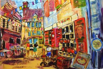
Summer Painting Weekend - Rye and Camber Sands - September 8th, 9th and 10th 2017
The HAS annual art weekend away for 2017 saw us visiting Rye and Camber Sands. Having moved the weekend to the latter part of the outdoor painting season we had a slightly better response from Members.
Rye proved to be an ideal venue enabling a choice of marine or town subject matter, however, as the streets were narrow and busy with tourists the majority of us stayed in the Old Harbour area.

- Summer Painting Weekend
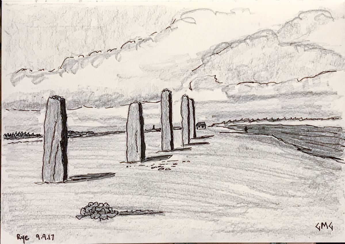
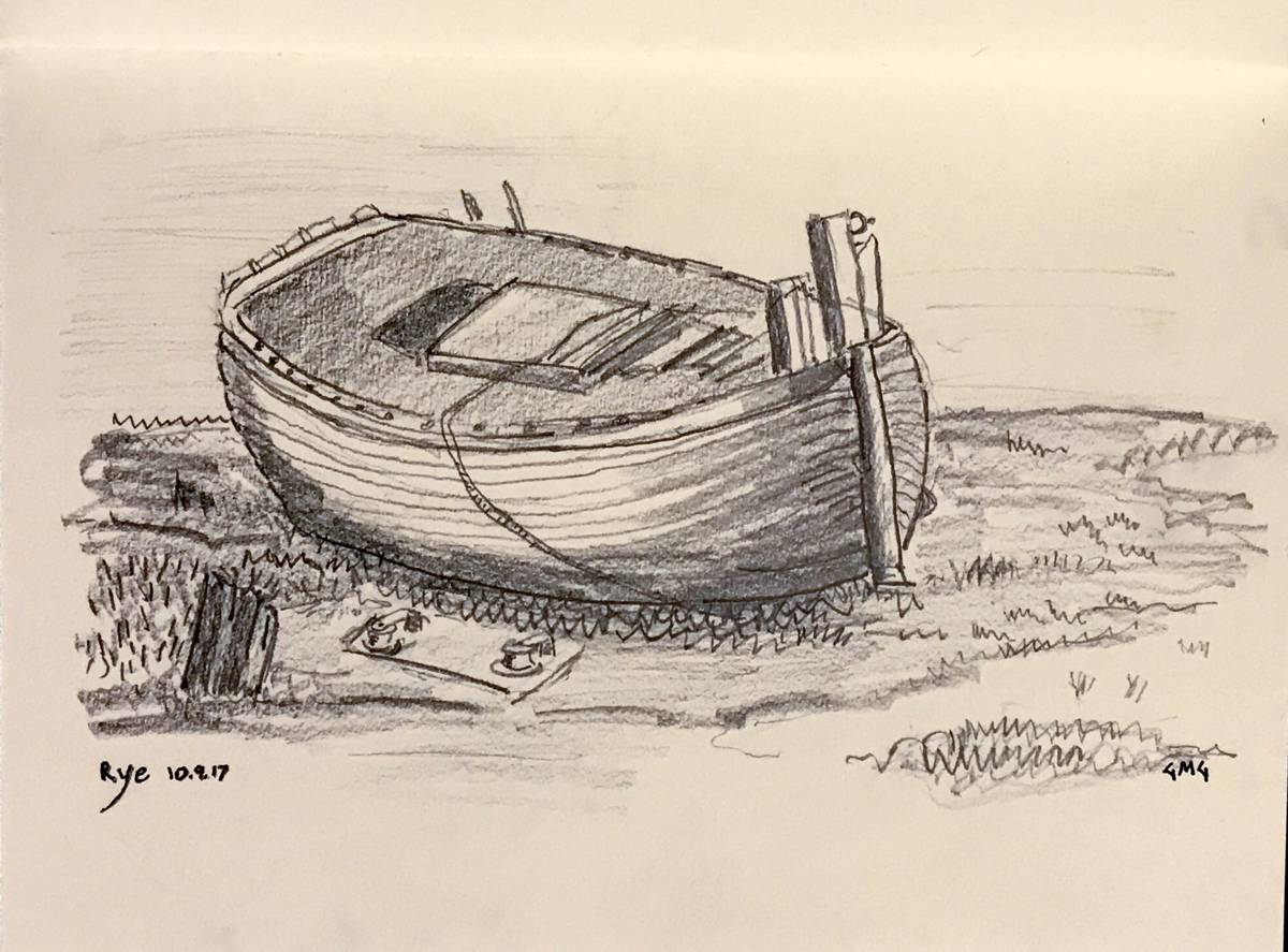
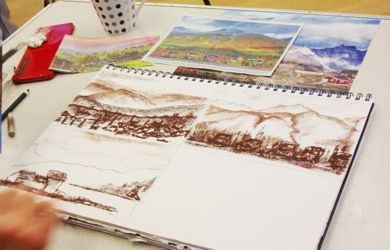
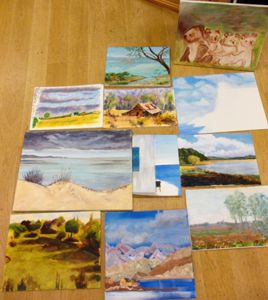
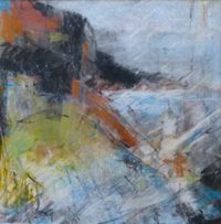
 George Garbutt - Sketch 1
 George Garbutt - Sketch 2
 George Garbutt - Sketch 3
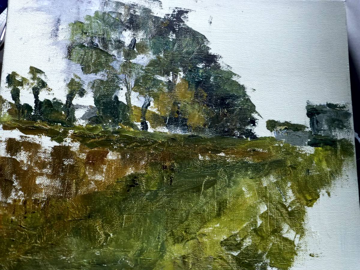
 John Jarratt - Derelict but once crucial
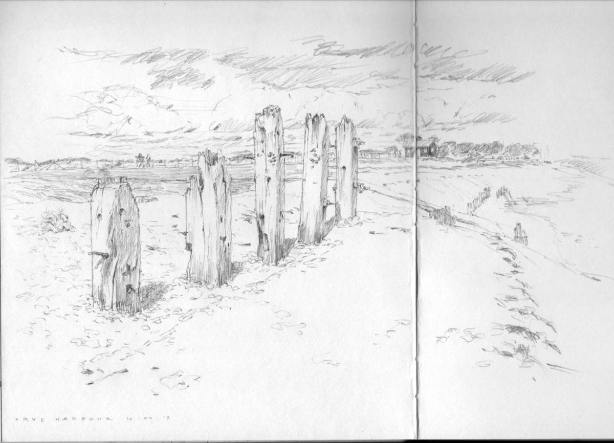
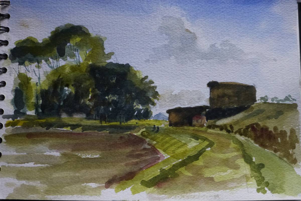
 John Jarratt - Sketch - the end of the waterway
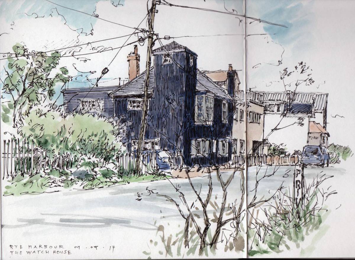
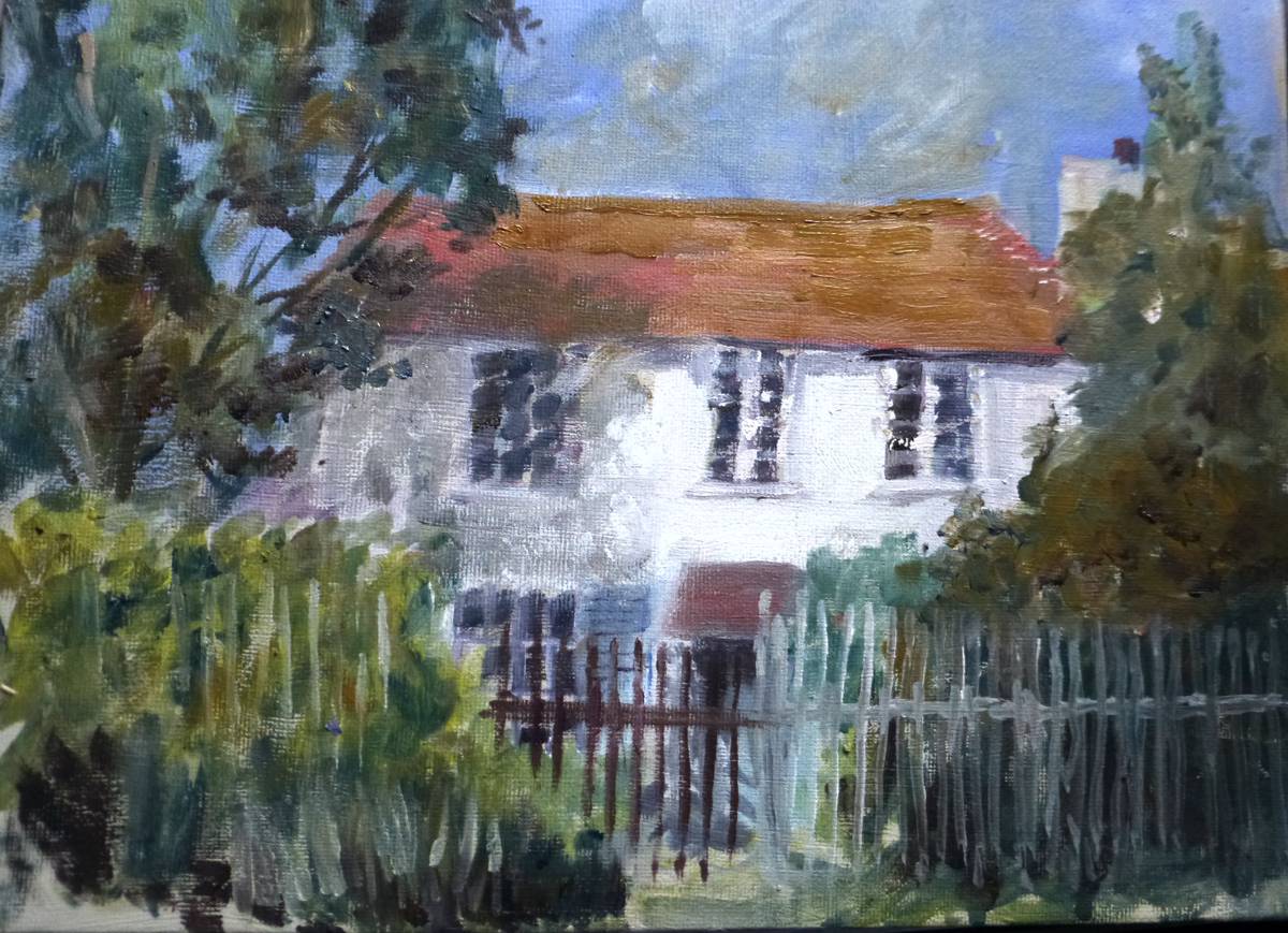
 John Jarratt - Watch Tower House
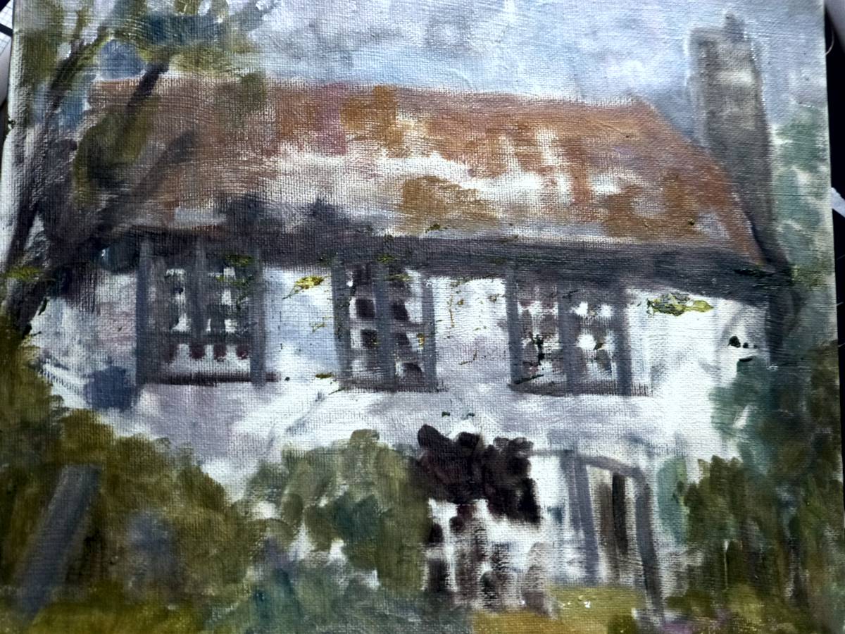
 Margo Ward - House - Oil
 Margo Ward - Oil
 Ray Ward - Acrylic
 Ray Ward - Watercolour
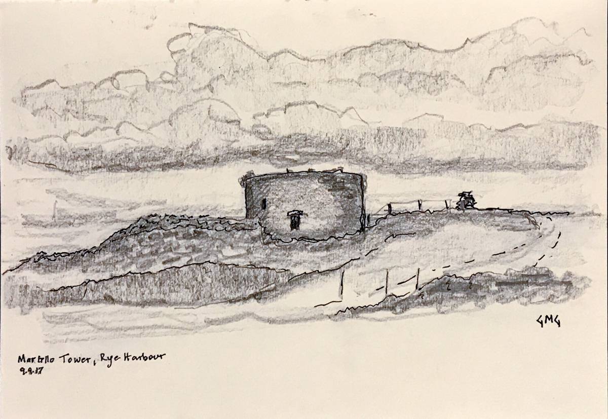
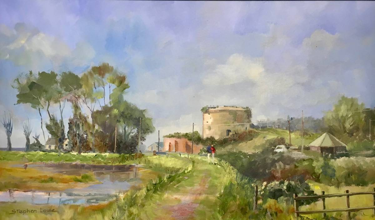
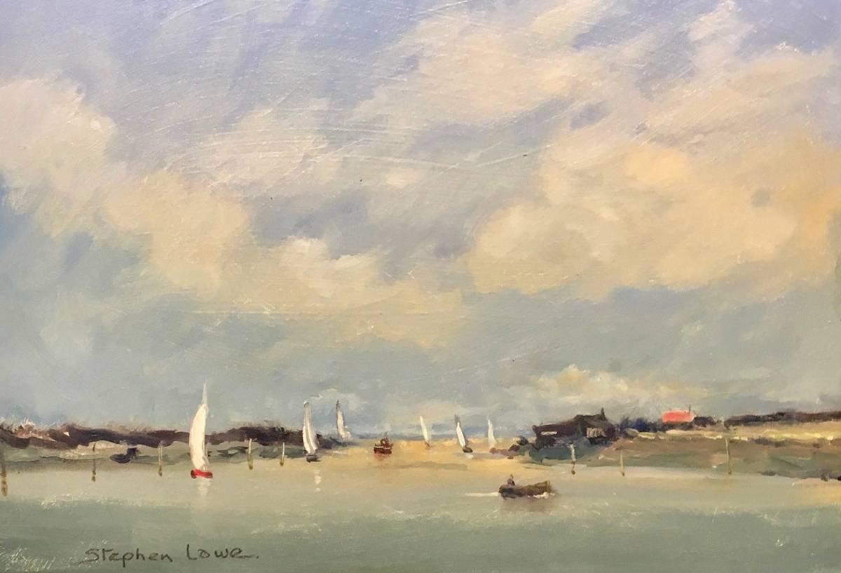
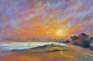
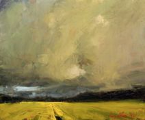
 Stephen Lowe - Martello Tower, Rye - Oil - 50 x 30cm
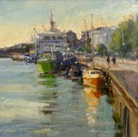
 Stephen Lowe - Sailboats, Rye Harbour - Oil - 25 x 20cm

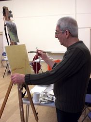
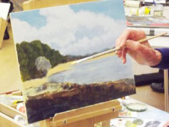
As I arrived at lunchtime on Friday I set up to paint in oils using the boot of my car as a cover to the impending rain (a good tip if you have a hatchback car) it was just the right thing to have done as light showers came and went most of the afternoon but still an enjoyable session of painting.
Friday night saw us in good mood enjoying a meal of fish & chips and talking of our choices in accommodation, the journey down and plans for tomorrow.
Saturday started with fine weather if a little breezy and I set to on an oil of the Martello tower from the flood barrier. The drama of a very high tide flooding the landscape and a flotilla of sailing boats taking full advantage of the breeze setting off to sea offered more choices than an artist could cope with and quite a few sketches ensued.
A fine meal on Saturday evening set us up for Sunday’s painting at Camber Sands. The wind was so strong it was like painting inside a sandblast machine! There's lot of gritty sand on my oil sketch which may prove useful for a future reference in a studio work later on.
Next year we are looking at Blakeney on the Norfolk coast, possibly in June, and members will be advised as soon as the possibilities have been researched.
Stephen Lowe
Printmaking Workshop at Hertford Museum - 14th June 2017
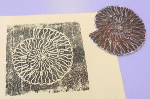 At Hertford Museum’s request Hertford Art Society is running workshops on different creative techniques during 2017. In June it was the turn of Printmaking and this session was led by artist Geoff Reynolds. The seven members of the public who signed up to the 2½ hour workshop were given an introductory talk describing what can be found in the Museum. They were then let loose to hunt down exhibits that would make good subjects for printing. Some quick design work, mostly on polystyrene tiles, and then the messy part of the workshop began as folk rolled out their ink and transferred it to the etched tiles.
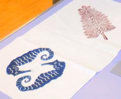
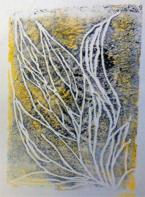
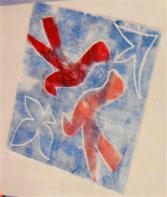
The result was a wide range of images reflecting what is to be found in the town’s Museum. Within a short while complete novices were turning out attractive patterns on paper and cloth, based on the exhibits on display. They left the workshop full of enthusiasm and looking forward to the next HAS Workshop. This link between the Art Society and the Museum can only be good.
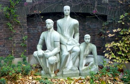
The Making of “The Trinity” - a sculpture by June Pickard for the garden of the United Reformed Church, Cowbridge, Hertford
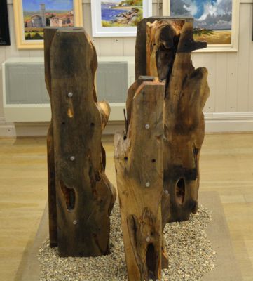
When the elders of the URC Church in Hertford asked if anyone in Hertford Art Society could make them a sculpture for their Church Garden I immediately thought of the planks of wood I had seen on numerous times on the balcony of the church. Whenever I saw them they suggested that they would make a lovely sculpture.
Working from photographs of each piece mounted on foam board I decided to make 3 standing figures representing the many forms of the number 3 in the bible. After deciding which pieces looked best together it immediately suggested the Father, the Son and the Holy Ghost.
The planks of wood must have been originally cut direct from a tree as they had not been trimmed because they still had the bark on in places and had natural holes and edges. These I left to give character to the figures. The Father is the most solid piece, the Son is made from the two narrowest planks and the Holy Ghost uses the planks that are most irregular. I also carved the top corners off the Father and Son figures so that they appear to connect with each other.
The pieces have a centre post cut from one of the planks and are bolted together with stainless steel bolts. To keep them securely in place they have brackets which are bolted into the ground. The planks were given 3 coats of preservative which enhanced the colours in the wood. To display the sculpture the sculpture at the 2017 Hertford Art Society Open Exhibition base is was covered with pea shingle.
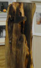
I hope the URC members and others get enjoyment from my interpretation of The Trinity for years to come. They will be installed in the garden to the right of the URC Church, Cowbridge, Hertford, during the summer of 2017 and can be viewed and contemplated by walking through the garden to the patio at the end where they will be positioned.
June Pickard
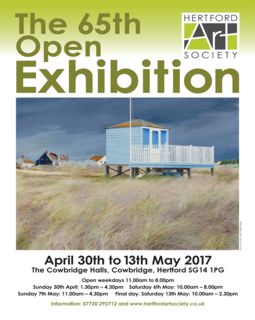
Prize Winners for Hertford Art Society 65th Open Exhibition - April 30th - May 13th 2017
Award Winners
- The John Goss Prize is awarded by Judges to the painting considered to be the best in show. This year it has been awarded to Roger Dellar ROI RI PS for his picture ‘Sunday Morning, Wexford’.
- The Lady Laming Award for Abstract Art is awarded for the best abstract picture in the exhibition. This has been awarded to Stella Green for her picture ‘Storm over St. Ives’.
- The Bill Dale Award is for the picture deemed by the Judges as showing the most merit chosen from among works by Members who regularly support the whole of the Society’s activities. The picture is by T John Jarratt for his picture ‘Late Snow near Ayot St. Lawrence’.
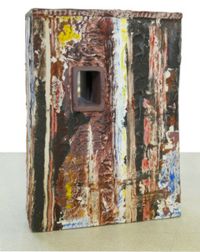
- The Mayor’s Award is presented for the best 3D work. This year’s award goes to Nigel Earle for ‘After GR’.
- The Edward Mason Brushes Award, as deemed by the Judges, is for the best watercolour painting in the exhibition. This has been awarded to Trevor Chamberlain ROI, RSMA for his watercolour ‘Evening Shade, Archers Green’.
- Visitors’ Choice Award - Trevor Chamberlain, ROI, RSMA 'Rainclouds over Malden' Watercolour.
2017 Hertford Art Society Open Exhibition Review
I have to say that I am totally awe inspired as to how people can find the words to form a review of an exhibition. With so many varied and intriguing pictures to look at and then somehow describe them will always amaze me. So when I was asked to write a review of the 2017 Open Exhibition I was daunted but definitely up for the challenge.
On thinking how to start I decided that the best way was to be as if entering the exhibition and ambling around as I would if just viewing.
On entry to the exhibition I noticed straight away “The Bubbles” by Sharon Wright, this item brought on great feelings of serenity and calm. The colours were moderate and the subject thought provoking, as well as very well executed. As I continued to shuffle around the pictures I was very impressed with the overall standard, as always. The mix of colour, shape and form was mind boggling.
Next to take my notice was “Holkham Bay, Norfolk” by John Rhoda. He had submitted two pictures in this style, which were very eye catching. These pictures brought to mind a likeness to that of Edward Seago, with its bright, high contrasting colours and very relaxed and free brushstrokes. Then not far from John’s picture I found Gillian Flack’s “French Farmhouse” which just oozed a wave of Mediterranean warmth. It provoked thoughts of eating French bread and drinking wine in the sun. The colours were harmonised and subtle and pleasant to look at.
Intriguing additions to the exhibition were three entries by Paul David Bell, “Alcalali”, ”Jalon Church” and “Lafranca”, all of which produced memories for me of works by Paul Gauguin, with their use of bright reds and oranges contrasting with the different hues of green all composed around large areas of light and dark. Continuing on as I moved around the screens I immediately noticed “New York”, by Carol Mountford, a well-produced picture that contained lots of colour, busy movement and imaginative thought provocation; typical of a busy city centre, all set in a semi abstract format that was none too heavy on the imagination.
Moving round to the large wall I saw another, very atmospheric John Rhoda picture, “Setting Sail, Snettisham, Norfolk. What an atmosphere, I felt as if I were to get soaking wet at any moment. I looked forward to entering the rear room where yet again there were a fine selection of exhibits. Immediately I took a shine to Anne McCormack’s, “Foreign Affairs”. Although the title sounded formal, the composition and style were definitely relaxed and pleasing to the eye. I almost cleaned my glasses as if mistaking them for producing a subtle image.
It was a joy to see Craig Alan Lee’s, “Spring is Near” this simple yet effective picture brought out all the pleasing colours of spring, in a nice simple format. It was becoming very obvious that simplicity in art can produce some of the best works. On seeing “Sunlit Harbour” by Ronald H. Johnson I felt as if I wanted to don my sun hat and sunglasses and kick my shoes off, because of the warming seaside feeling it portrayed, nicely bright and cheerful.
Denise Allen has entered a totally colourful picture with “Cosmic”. This picture draws the eye into a swirling cosmos of light and colour that keeps one affixed for a long time. This style of picture is fast becoming a must have and always draws attention. The picture “Urban Dusk” once again showed the keen and inventive mind of Kathy Burman, with meticulous attention to detail and a corresponding view to colours and composition. Full of hectic urban life.
John Killens, “Shed with the Blue Window” showed a mix of detail and impressionism, again a picture that required some serious studying. I then came across a very surprised rabbit that looked as surprised as I did, and then he gave me that steely look with just a glint of mischief and I knew straight away we were friends, lovely picture by Martin Payne, “Caught in the Headlights”.
The next works to take my attention were the two pictures by Anthony Parke – “The Jewels of Ms Kingfisher, Preened” and “The Strange Face of Mr Owl in Delightful Flight”. These were very precise and the colours intense but so realistic they could be mistaken for photographs. The amount of work put into these pictures must have been enormous. I next spotted the detailed and what seemed the most contentious picture, that of “Coke” by Brian Young, I thought this a masterful piece of art work in keeping with modern poster style pictures. It would appear that some visitors, though very, very few, did not think this picture appropriate. All I ask is – in the art world, what is appropriate?
I would like to touch on the abstract exhibits. These are not my forte, but there are some that do take my notice. “Forest Floor” by Malini Croxson was a fine example of abstract art being understandable to the ordinary person. It was bright and colourful with the titles meaning being in plain sight and an enjoyment to behold. On the other hand there is Jean Noble’s, “Spirit of Autumn”. One had to use one’s imagination and back this with the wonderful autumnal colours and behold a view which did appear though the mists of an autumn day.
I must touch on the 3D collection, as is good to see, the numbers submitted were up on last year and the standard is still persistently high. The two items that took my eye were “The Zebra Crossing” by Maria-Luisa Wilkings, this is a follow on from last year’s entry and very joyful to look at and admire. Also, of interest was “Dancing Smoke (Indiana Limestone)” by Mary Spencer, impression giving forms of fluid movement and sweeping shapes, very pleasing.
The prize winners were true to form and represented the best of the forms and styles submitted. Well done to those winners; Roger Dellar, Stella Green, T. John Jarrett, Nigel Earle and Trevor Chamberlain.
In conclusion this was yet again a very successfully arranged and organised exhibition (well done Michael Radley) that was full of variation, colour, size and subjects. A delight to see, perhaps it would be even more pleasing to see some new names appearing in future catalogues, to add more spice to this already “spicy” exhibition.
Paul D. Swinge
East Herts Decorative and Fine Arts Society
Each year for the last 6 years EHDFAS has sponsored the 3D award at Hertford Art Society's Open Exhibition.
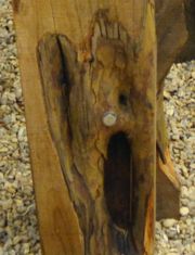
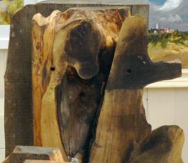
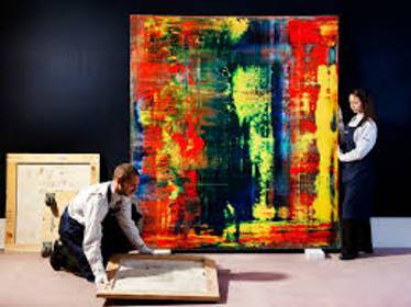
In 2017 the prize was awarded to Nigel Earle, a local ceramicist. The winning piece is titled ‘After GR’. This alludes to a living artist, Gerhard Richter, whose paintings and textures inspired Nigel to translate Richter’s 2D work into a 3D format. The images are Nigel's work, and one of the pictures that inspired his piece.
Nigel has a studio in Hertford where he creates highly original table-top ceramic pieces ‘that explore layers, recesses and hidden spaces’.

EHDFAS Members enjoy monthly talks at the Spotlight Centre in Broxbourne on a wide range of arts subjects well beyond the decorative and fine. Among other things we also go on visits to outstanding buildings and galleries, hold Special Interest days and sponsor Young Art in local schools.
Several members of the Hertford Art Society are members of EHDFAS. For more information on EHDFAS please visit their website.
Public Art in the City of London - Illustrated talk by Alexandra Epps - 18th April 2017
Alexandra Epps, a graphic designer, NADFAS lecturer and City of London Guide was welcomed back for a talk on Public Art in the City of London, concentrating on modern and contemporary art. The City has been her home for over twenty years and since qualifying as a guide she is keen to share the stories of its public art, iconic architecture, and fascinating history.
“The role of Public Art is to enrich the environment in which we work, play, learn and live” - Listing Team, Historic England.
Alexandra led us through some of the most exciting public art: sculpture, relief, wall decoration in this most remarkable square mile, the City of London with its two thousand years of history. Photographs (by kind permission of Art in the City) illustrate some of the works - others are easily found online.
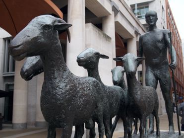
Paternoster - Elizabeth Frink - 1975
Situated in Paternoster Square in the shadow (among the columns) of St. Pauls Cathedral, this bronze sculpture of a shepherd with his flock alludes to the idea of pastoral care, the religious community and the freedom of the city which allows sheep to be led across London Bridge. Frink wanted to capture the essence of man - strength, vulnerability and sensuality. Her original sculpture was plaster on a wire armature, the textures translated into bronze.
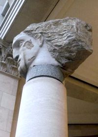
Angels I to V - Emily Young - 2003
These stone heads sit on columns gazing towards St. Pauls and the artist blended old and new, with the distressed natural stone contrasting with the smooth carving. These are “children of the Earth” and each has its own presence, which the artist allowed to emerge from the stone without prior design. There are others behind Tate Modern. They are large and imposing, carved with tools from Purbeck stone.
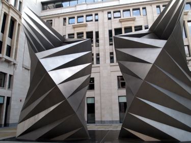
Paternoster Vents - Thomas Heatherwick - 2002
These are often referred to as simply “Vents” (also referred to by some as “Angel’s Wings”). The sculptures, made of welded stainless steel, are 11m tall and produce ventilation for an underground electrical substation in Paternoster Square. Beauty and practicality combined. This artist designed the Cauldron for the Olympic flame.
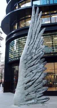
City Wing - Christopher Le Brun – 2013
(current president of Royal Academy – painter and sculptor)
This wing, which is part of a series, is 10m. tall in painted bronze. This could represent an angel’s wing, a bird’s, Mercury’s or be the wing of a dragon, the symbol of the City. You choose.
Nail - Gavin Turk - 2011
A total contrast, Nail is a 12 metre bronze sculpture painted to appear like a giant rusty nail. Standing outside the One New Change, shopping centre which reflects St Paul’s cathedral in its mirror-like glass windows, it is rusty and tactile. Nail is a nostalgic reference to traditional tools now rarely used and references the intersection of two worlds of history and money.
Relief panels - Mitzi Cunliffe - 1969
Cunliffe developed a technique for mass-producing abstract designs in relief in concrete, as architectural decoration, which she described as "sculpture by the yard”. This set of reliefs originally decorated the façade of the Scottish Life House in Cheapside. They are 4ft. square and serve as emblems or signs. Cunliffe was based in Manchester and everyone recognised the golden BATFA mask, which she designed.
Ceramic panels - Rupert Spira - 1992
Spira perfected the art of interlocking geometric tiles with various complex glazes. In 1992, he received a commission to build a mural at the rear of an office block on the East side of New Bridge Street in the City of London. The result is 23 beautiful handmade stoneware panels made up of 18,000 tiles. The artwork is arranged as a visual game for the pedestrians, its beautiful glazes mixing reds, blues, turquoise, green and grey form an optical illusion and the murals run the entire length of the rear elevation to the building. The forms are reminiscent of Escher.
St Stephen’s, Walbrook
Just a couple of minutes’ walk from both Bank and Cannon Street tube stations, this church is considered one of Christopher Wren’s masterpieces. It sustained some but not irrecoverable war damage and was restored, and many of the monuments and furnishings survived. The stone altar (which caused some controversy when it was commissioned) is by Henry Moore (1972) and the circlet of colourful kneelers surrounding it were designed by Patrick Heron (1992). These are set directly below Wren’s beautiful dome and the seating in the church is, unusually, in the round.
Adam and Eve stained glass by John Hayward - 1968 at St Michael Paternoster Royal
War damage gave an opportunity to provide new, modern images for these Church windows. This is one example of a range of fascinating post war stained glass on offer within Wren’s restored churches in the City.
Revolution in 2 parts - Rob & Nick Carter - 2005
This is a window installation at 200 Aldersgate comprising concentric circles of neon, a striking modern, ever changing, target-like image.
Time and Tide - Simon Patterson - 2005
Situated in Plantation Lane this artwork is a wall with a moonscape in changing colours, and an evocative pavement etched with key words relating to the city and its history. Old meets new with a church tower at the end of the lane and reflective windows opposite.
Chromorama - David Batchelor - 2015
Set within Sun Street Square next to 5 Broadgate, this totemic sculpture (22.5m tall) of coloured boxes acts as a signpost. It is illuminated at night and creates a striking meeting point for visitors to the Broadgate Centre.
Memorial to Heroic Self Sacrifice - George Frederick Watts - 1899
 Postman's Park G F Watts' Memorial |
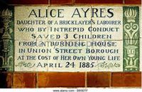 Postman's Park Tribute to Alice Ayres |
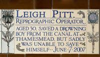 Postman's Park Tribute to Leigh Pitt |
Situated in Postman’s Park, just west of Aldersgate Street this poignant, sheltered wall records the names of people, in a series of tiles, who gave their lives in saving others and details their heroic acts. The first 24 of these were made by William De Morgan, the balance by Doulton’s of Lambeth. They record these events in touching detail.
Zodiac Clock - Frank Dobson & Philip Bentham - 1959
This unusual astronomical sundial related clock is situated on Bracken House, Cannon Street. It features the face of Winston Churchill, (a personal friend of Brendan (Bernard) Bracken). This is surrounded by gilded signs of the zodiac, on an azure background. Bracken ran the Ministry of Information, supposedly the model Orwell used for his Ministry of Truth, and some say the initials of Big Brother are no coincidence.
Gilt of Cain - Michael Visocchi & Lemn Sissay - 2008
This powerful sculpture commemorates the abolition of the transatlantic slave trade in 1807, which began the process of the emancipation of slaves throughout the British Empire. It is situated at Fen Court, Lombard Street. A group of columns surround a podium. The podium calls to mind an ecclesiastical pulpit or slave auctioneer’s stance, whilst the columns evoke stems of sugar cane and are positioned to suggest an anonymous crowd or congregation gathered to listen to a speaker. Extracts from Lemn Sissay’s poem, ‘Gilt of Cain’, are engraved into the granite. The poem skillfully weaves the coded language of the City’s stock exchange trading floor with biblical Old Testament references.
Memorial to the people of London who died in the Blitz during World War II - Richard Kindersley - 1999
This memorial, carved from a three ton block of Irish limestone is positioned outside St. Paul’s Cathedral.
Three Printers - Wilfred Dudeney RBS - mid 1950s
A monumental, life size sculpture, the only public monument to British newspaper-making, was originally situated off Fleet Street. Redevelopment followed and the sculpture ended up in a Watford demolition yard. It now has a new permanent home in a corner of the Goldsmiths’ Company garden off Gresham Street in the City of London.
Monument to Baron Paul Julius Reuter - Michael Black - 1976
Situated behind the Royal Exchange, this was commissioned to mark the 125th anniversary of the foundation of the world news organisation that bears his name. It is a bust set upon a block. The block is engraved with wording in tribute to a pioneer of communication in print.
Murals - Dorothy Annan - 1960
Previously installed on the outside the Central Telegraph Office in Farringdon, these 9 panels as celebrations of 20th Century technology have been saved, listed and relocated to one of the Barbican highwalks.
Resolution - Anthony Gormley - 2012
‘Pixelated’ figure at Shoe Lane/St. Bride St. formed of cast iron (terracotta) blocks.
Alexandra advised us that the Corporation of London is one of the largest sponsors of Art in the country and that a great deal of money was originally invested in public art in the Broadgate area. Each summer works are installed throughout the City in the Sculpture in the City programme and there is always something new, be it projected images onto the dome of St. Pauls (Martin Firrell) or Ben Wilson painting discarded chewing gum on Millenium bridge.
Alexandra was warmly thanked for providing such an exciting talk on the wide variety of art forms to be found in the City and acquainting us with the work of artists, some familiar and some new to us, whose artworks grace this square mile.
The work of Mary Beale (1633 - 1699)
Visit to West Lodge Park, Hadley Wood - 21st March 2017
We were made very welcome by Mr Andrew Beale the current owner of West Lodge Park, a Beales Hotel - originally a hunting ground for kings and queens. It is a family run hotel with a beautiful Arboretum and a heliport within its grounds. The main purpose of our visit was to see the collection of paintings and learn about his famous ancestor, Mary Beale.
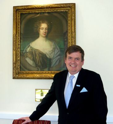
Andrew Beale with a self portrait by Mary Beale.
Mary Beale (1633 - 1699) was Britain's first professional female artist. She had her own studio and painted portraits of high society figures of the day plus family portraits as well. She was both talented and prolific and at the height of her fame in 1677 she painted 83 portraits and earned the then considerable sum of £429. Unusually for the time, her husband Charles helped look after their children Bartholomew and Charles and he also kept accounts and booked sitters for his wife Mary. His detailed accounts are in note books that still survive in the British Museum today and in the National Portrait Gallery which gives insight into life in the latter half of the 17 century after the restoration of the Monarchy.
Some of Mary Beales paintings and others of note are located in various rooms at this hotel and Andrew kindly gave us a guided tour around their collection. They were mainly collected by T Edward Beale CBE, Andrew’s Grandfather.
If the people in the portraits could step out of their frames today many of them would know each other. King Charles would remember Lady Fairfax whose husband invited him to return to the throne of England, his Secretary Henry Coventry and his Loyal Courtier John Evelyn and his voluptuous mistress Barbara Castlemaine. In another portrait the King may well have cast an appreciative eye on his queen's Lady in Waiting - Margaret Blagge.
Quite a few of the portraits are painted in the oval as this was a popular surround of the time - examples below - and not all the paintings there are by Mary Beale. The one of King Charles II was originally painted by Peter Lely (a Dutch artist). It is said that Mary Beale also did many copies of this famous painting and sold them to many who could not afford the original - somewhat like the prints that we have today and can buy the copies cheaper than the originals. These artworks can be viewed on the West Lodge Park website.
The evening ended with tea / coffee and biscuits and all who attended this evening said they enjoyed it very much and some were pleasantly surprised that this treasure of a hotel existed so near to us in Herts.
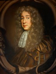 The Sixth Earl of Coventry by Mary Beale |
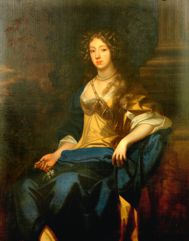 Mrs Sidney Godolphin (nee Margaret Blagge) |
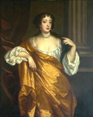 Barbara Villiers, Duchess of Cleveland, nee Castlemaine, by Mary Beale |
Talk and Show - Mixed Media by Val Pettifer - 31st January 2017
Val Pettifer visited HAS on Tuesday 31 January and gave us an interesting evening called “Talk and Show” on Mixed Media.
The evening started with a large selection of materials and books laid out on three long trellis tables and a few examples of finished pictures in mixed media with a variety of finishes. She introduced herself as having a passion for art in childhood and after retiring this passion was rekindled. She did various courses with great enthusiasm over a few years before investing in the "Old School Studios” in Whittleford Cambridge - just off the M11 at Duxford. She runs various Workshops and Drop In days. These are very convivial surroundings and Val is encouraging and works to each individual’s strengths. She also has visiting artists leading some of these courses.
Right: Val Pettifer - Les Trois Filles - Collage Acrylic
For this visit to us at HAS she showed us how to create a mixed media picture starting with a photograph of a scene from Venice and layering the canvass board by gluing on different bits of paper torn at random roughly matched in either colour or pattern to the scene at hand. Suggesting the use of crumpled tissue for a watery effect or cut out lace used to create a different end result. She poured different coloured inks over these spreading the colours with her fingers but maintaining a little distance between each colour so as not to smudge and mix the colours up too much. There was not enough time to complete this picture within our two hour session as time was needed to dry each layer in-between and she took time showing us all the different paint effects she uses in order to create an interesting end result. It seems a fun way to create a picture and Members thanked Val for an interesting and stimulating evening.
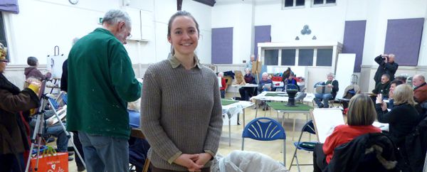
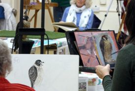
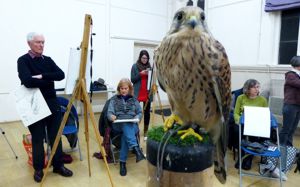
Birds of Prey - An opportunity to draw and paint four birds of prey presented by Kirsty Allen, Falconer - 24th January 2017
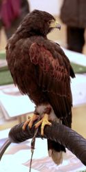
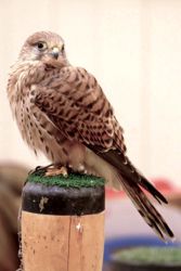
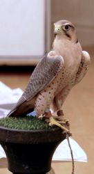
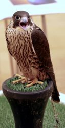
Harris Hawk, Kestrel, Lanner Falcon & Peregrine Falcon.
Pennine Falcons is situated in the heart of the Pennines and is led by Kirsty Allen; a young falconer who has been practicing the sport since 2007. She has had a lifelong passion for all birds, particularly birds of prey. She has experience working with the BBC and Silverback Films, Vogue Magazine with Helen Macdonald, has featured in the National Press and is highly regarded within the industry. Kirsty is the daughter of Member Denise Allen and we were delighted to welcome her and four of her Birds of Prey for this very different Members’ evening.
The birds were set up in the middle of the floor and were very calm. Kirsty introduced us to a Kestrel - Susie, (who fluffed up her feathers and was very relaxed all evening), a Peregrine Falcon - Bibs (who needed to be hooded later in the evening as she was calling loudly!), a rather stately Harris Hawk - Lucas and a very active Lanner Falcon - Nala with gorgeous plumage. It was a challenging drawing experience. Fortunately the birds would adopt the same pose every so often so a series of drawings was the order of the night. Some brilliant sketches, and even paintings resulted from two hours observing the birds at rest. They were alert and seemed interested in the proceedings. It was lovely just to sit and watch them and such a novel experience being with such beautiful creatures.
Kirsty and her team are involved in breeding these birds and gave us an interesting talk about their various attributes and habits. The Lanner Falcon can dive onto prey at speeds exceeding 200mph. She regularly takes birds across the border into Scotland for exercise and hunting. Do visit the website at penninefalcons.com for some spectacular photographs of birds in action.
This was an exceptional evening, very well attended and Kirsty was thanked for bringing her birds such a long way for our enjoyment and interest. We hope to welcome her back in 2018.
Tonal Values Workshop with Chris Christoforou - 12th November 2016
Chris Christoforou has been a professional artist for 30 years and has built an international reputation for his work, since he started as a commercial artist. He is well known for his depictions of wildlife, although he enjoys painting all manner of different subjects. He has written many articles for art magazines on various art materials, including his own painting techniques. He visited us on the “Critique” evening that began our Winter Programme for 2016 and when he was invited for a workshop with us he suggested the topic of “Tonal Values” as this subject had arisen during the Critique. Thus this was the subject for the day and it turned out to be a very interesting and enlightening tutorial.
The workshop began with monochrome sketches using photographs which the artists had selected as suitable for this exercise. To create an image with a clear foreground - middle ground - background in black and white for example you can use just black (ink or paint) and progressively dilute it to get a vast range of tones from initial black all the way through shades of greys by reducing the strength of it till it reaches no colour at all. This tonal range can also be achieved in pencil or charcoal. Chris suggested that we experiment (later) with creating a “Grey Scale” for our own use.
The same principles apply when using colour. To achieve the fine detail in his paintings Christ uses Chroma Atelier free flow acrylics which are liquid - he was involved in the development of this range of paints. He showed us a selection of his work and we were surprised to learn that he often starts with the darkest shades. We also learnt that it was better to paint in layers and dry each layer with a hair dryer, as acrylics are not as fast drying as one might think. He recommended working this way, adding colour, increasing the tone or decreasing it as required. Once the background is established by this method then one can approach towards the final details in order to create beautiful “Tonal” effects.
Having selected the image they felt best illustrated the desired tonal qualities, artists began working in their chosen medium on a larger scale with advice from Chris.
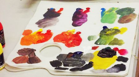
There was a special half hour devoted to observing Chris demonstrate what exactly each colour tube contains and why it is so important to know its content in order to achieve the required colour mixes. He illustrated this by using two bottles of each of the three primary colours (Lemon and Cadmium Yellow, Cerulean and Ultramarine Blue and Cadmium Red and Alizarin Crimson). He created a number of mixtures to demonstrate the properties of these colours. For example it is only possible to mix a true orange using Cadmium Yellow and Cadmium Red as these do not contain any blue pigment. This was a useful refresher on colour mixing.
 It is possible to mix an “almost” black from Red, Blue and Yellow but if any of these contain some white one can never achieve a true black end product. Many colours contain white pigment - we were advised to select only those without a hint of white for mixing true darks. A combination of Burnt Umber and Ultramarine can create an intense Black. These and many more valuable insights on paint colour contents will hopefully help those who attended to improve their works of art.
All the participating artists said that they had learnt a lot within the four hours as we all had a good portion of individual attention from Chris as well - thus gaining hints and tips on how to begin and progress with our chosen pictures.
This was a very enjoyable afternoon which produced a dramatic range of work, focussing on strong tonal contrasts. Many thanks to Chris Christoforou for coming and giving us a good basic insight on “Tonal Values” and its importance to our art works.
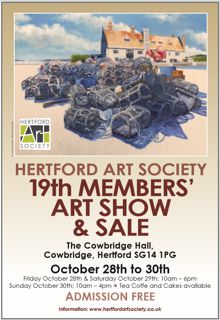
The 19th Members’ Art Show and Sale
28th - 30th October 2016
For only the second time in its history, this took place at the Cowbridge Halls, Hertford. Once again the Members rose to the occasion and put on a varied and vibrant show of work of a very high standard. The light and spacious surroundings made this a show which was a delight to walk around and, of course, there was the lure of tea and homemade cakes at the back of the hall! Visitors have told me and other stewards how much they enjoy this show and what a credit it is to the Society. Thirty six paintings were sold and also many cards (always a popular feature of the show).
Left: 'Spirit of St. Pancras, Renaissance Hotel' by Bob Boenke. Right:
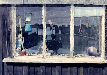
'Shed Window at Walberswick No.1' by John Jarratt.
As always, the subjects of the paintings were many and varied but I did notice that the effects of light on the subject, be it landscape, portrait or still life, were a strong feature of this show. Atmospheric lighting was evident in all the award winners' paintings.
Left:
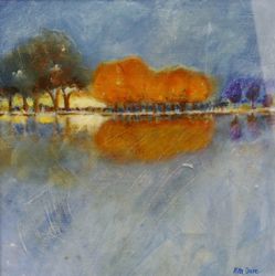
'Autumn Glow' by Rita Dare. Right: 'Lunch' by Craig Lee.
Award winners were:
- John Godden Award (Members' Choice): 'Autumn Glow' by Rita Dare - a painting which lived up to its name with glowing colours.
- Visitors' Choice Award: 'The Soloist' by Chris Baker - a moment of stillness as a ballet dancer pauses, beautifully lit and in a restrained palette.
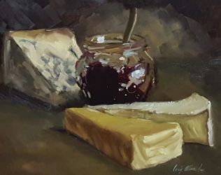
- May Bennett Award (Still Life): 'Lunch' by Craig Lee - a little gem of a painting of bread and luscious cheeses which looked positively edible!
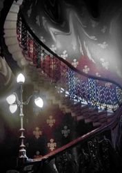
- Mark Ely Award (Most Innovative/Intriguing Work): 'Spirit of St. Pancras, Renaissance Hotel' by Bob Boenke - a fascinating digital monochrome image with the famous spiral staircase and ghostly images - very appropriate for the Hallowe'en weekend.
- The Marie Goldsmith Award (for a Member who has not received formal recognition but continues to show a high standard of work). A new award in memory of a much missed Member: This goes to John Jarratt for both past work and his painting 'Shed Window at Walberswick No.1', a masterly painting which drew crowds of admirers in the show.
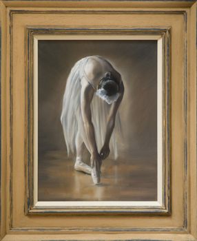
'The Soloist' by Chris Baker.
There was great variety of paintings, in a range of media - something to suit every taste. In addition to the framed paintings, artists contributed unframed works and some 3D items. Our 3D artists are encouraged to contribute more of their work in future shows as the Cowbridge Halls is an ideal space to display sculpture and other 3D items.
Finally, our thanks go to all those Members who worked hard for their Society's Show, whether setting up or dismantling, stewarding or making teas (and cakes!). You are too many to name but we all know who you are and we all appreciate the time you put into making this show such a success.
Demonstration in Acrylics by Hashim Akib - 11th October 2016
Hashim Akib originally worked as an illustrator. This gave him valuable experience in developing drawing skills, conceptual ideas and various painting techniques. Throughout his career he has won many awards and exhibited in many prestigious galleries. His first book entitled ‘Vibrant Acrylics’ was published in 2012, has been translated into French, German, Italian and Dutch and includes a companion DVD of the same name. He has further books - ‘Cityscapes’, ‘Absolute Beginners’ and ‘Portraiture’ - in the pipeline. He contributes feature articles to many art publications and runs regular workshops.
![]()
![]()
Hashim asked the audience to choose from three portrait photographs and had prepared a large canvas with a turquoise ground in acrylic. He prefers to work with a vibrant ground colour on his canvasses, always has a selection prepared and chooses one to compliment the subject. He uses Daler Rowney System 3 Heavy Body acrylics for his demonstrations. Having worked with them in their relaunch of these paints he finds them most suitable for his style of painting. He has a palette prepared with a range of vibrant colours in deep pans and works with large flat Daler Rowney square head brushes and Liquitex paddle brushes.
![]()
![]()
The chosen portrait was of an elderly African woman, full of character, and Hashim began by dipping a 4” flat brush into a variety of colours - violet, yellow ochre, red, burnt sienna, green, magenta (Hashim is all about colour) and dragging the brush vertically down the canvass with the colours blending naturally and giving energy to the mix. He used darker tones for what would become the shadow side of the face, adding a little Titanium White to the mix to create pastel shades for the lighter side. The next stage added bold diagonals to indicate contours and features, still with broad strokes. Colour is key and the aqua ground glows through in places.
Hashim told us that he originally painted very realistically with each painting taking perhaps a month to complete - by which time he was pretty bored with the subject. The work lacked character and his quick “sketches” were much more exciting and were favourably received by critics. He changed his approach and now paints quickly, using strong colour and form.
![]()
Having broadly established the face, Hashim uses white mixed with a variety of colours to create the headdress and garments framing the face, creating the outline, again using vertical strokes. Using a corner of the brush, highlights are added with vibrant colours. He enjoys the beginnings of a painting but the final stages are vital to enhance the highlights and lowlights. “This is dangerous,” he said, referring to the point where final touches are needed. Bold darks and additional highlights are added and the face comes to life. The portrait is left “almost finished” so that Hashim could quickly demonstrate a landscape.
![]()
![]()
His chosen photo was an autumn scene with a dark bridge over a brightly lit river. On a lilac ground he applied bold orange, yellow and red strokes, dragged down and across for the brightly lit trees in the distance. Dark browns added for the middle ground trees and bridge. Bold angular touches are added with the edge of the brush, gradually building up rich tones of red, green and brown. Pale turquoise blue is added for patches of sky and highlights of pale green, aqua, gold and yellow ochre to bring light to the trees and reflections in the water. Finally strong dark blues exaggerate the trees, bridge and reflections and some zingy highlights in lemon yellow are added. This was a really quick sketch and from an abstract start the image became more defined.
![]()
The two pieces of work were quite different but both illustrated Hashim’s bold style and love of colour. This was an exciting, whistle-stop demonstration and showed what can be accomplished in a short time. Hashim’s strength is in the underlying drawing and awareness of the impact of the colours he selects. Each stroke of paint is the right tone and in the right place. This was a brilliant evening and Hashim was warmly thanked for sharing his exciting approach to painting with us.
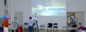
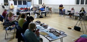
Pastel Workshop - 27th September 2016
Following Les Darlow’s pastel demo the previous week we all set-to on Tuesday evening to emulate his bold, confident wielding of bright and dark colours. A large skyscape was projected onto the hall’s end wall and the lights dimmed at that end. Of course this had the side effect of making some of us work in near darkness with difficulty choosing colours. A couple of sensible members next to me got by with the use of torches!
  |
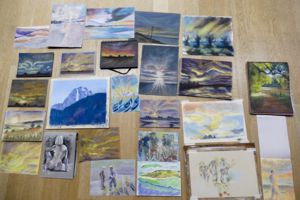 |
Despite this and in the better lit end of the hall much excellent work was done including other references. Complete silence reigned for most of the session. The standard of work was quite excellent and, hopefully, much was learned from the exigencies of having to use a medium possibly rarely attempted.
Light, Energy and Movement - Demonstration in Pastel by Les Darlow - 20th September 2016
Les Darlow trained as a technical and scientific illustrator (with a 5 year diversion playing in a rock band!) and produced photorealistic images. His art was transformed when someone bought him a set of pastels. He found this medium perfect for painting freely and expressively, creating paintings based on light, energy and movement. He now considers himself an impressionist and loves the medium of pastel for its colour and intensity.
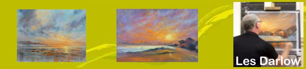
He showed us some examples of recent paintings, introduced us to his chosen materials and announced that he would be producing three paintings over the course of the next couple of hours. The audience was intrigued.
Many artists struggle with pastels and Les feels that this is, to a large extent, due to inferior materials. He often teaches groups where most of the painting ends up as dust on the floor. Having experimented with many different brands he now recommends Rembrandt and Jackson (hard pastels) and Unison (soft pastels) together with Canson “Mi-Tientes” pastel paper containing more than 50% cotton (which reduces absorption of pigments), comes in 50 colours and has one smooth surface and one with an “orange peel effect”. This also comes in a micro abrasive surface, Canson “Touch” (like fine sandpaper). Coloured backgrounds can be created on this paper using inks. He also feels that there is a temptation to use pastels too thickly - in his view “less is more”. The chosen background colour is important as, using his technique, this will be an integral part of the painting, setting the mood.
He loves painting skies and extremes of weather and often works outside. If he is working from a photograph, he spends time sketching the scene working out tonal values and balance in pencil or marker. He recommends Promarkers from Letraset (tones from light grey to black in easy to use marker pens) for quick sketches as these create monochrome drawings where the values (percentage of intensity) can be established. He then advises discarding the photograph and letting memory and imagination take over.
Les then embarked on the first image. On the smooth side of a sheet of warm dark grey paper he proceeded to lightly indicate the position of features and the tree line. He then applied colour to the sky area using the side of hard pastels (shades of purple, dark blue, turquoise, orange & yellow) working from dark tones below to brighter colours on top. The strokes were bold and directional, drawing the eye to a point on the horizon. The colours were blended by hand - one pass - and more colour added, particularly yellow to the setting sun. Winter trees were then added with vertical strokes of Prussian blue and dark brown for the shadow side and warm reds for the sunlit side, to echo the sky. If excess builds up on the paper, a towel can be used to remove this. Fine light strokes with the sharp edge of a hard pastel indicated trunks and branches. He established and constantly refined the forms, bringing out highlights on the castle and using dark blue and black for the shadow side. The snow-covered bank was established in light tones and the foreground was established with lightly applied strokes of purple and blue. He defined the edge of the lake with black (he loves black - not a colour often recommended). Reflections of the trees and castle were created with bold vertical strokes dragged down with the back of his hand and distorted. Softer pastels are chosen for more intense areas and with a few final touches the image is complete.
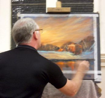
Lakeside Castle on Dark Grey Ground
It was noticeable that Les worked methodically from top to bottom of the painting, applied the pastel lightly but boldly and didn’t fuss. The resulting painting was full of warmth and drama (and took about half an hour).
The following two paintings (both on the micro abrasive “Touch” surface, one on a soft blue-grey and the other on a rich dark red) used the harder pastels and followed a similar process of building up colour. This surface is rather hard on the fingertips when blending so plasters or gloves are useful. No blending was used in the sky of the last image, the colours really sing out. Use of these two different tones really illustrated the impact of the background colour on the finished painting.
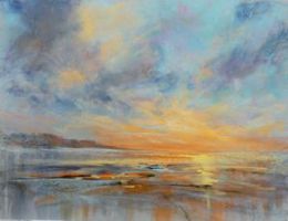 Skyscape on grey-blue ground |
 Sunset View on dark red ground |
The Canson papers are also useful for other media - charcoal, pencil, and tough enough for watercolour and gouache. Fixative may be needed for the micro-abrasive paper but the 50% cotton Mi-Tiente paper holds the applied pastel very well. As fixative can dull the colours, it is likely that some pure pastel will need to be applied to bring the colour back. Care should be taken not to “fill” the tooth of the paper.
This was a very exciting demonstration. Les answered questions and gave valuable advice throughout, talking us through the process. His main points were to keep the image simple, take away complications so that the viewer can take a trip around the painting and establish the values of foreground, mid-ground and background to give depth to the image. Light, energy and movement was the theme. This was certainly accomplished and Les was warmly thanked for an excellent presentation.
The Art Society will be having a workshop based on this demonstration. Many members are inexperienced with pastels and will have this stimulating demonstration in mind as they tackle this challenging medium. Les Darlow made it look easy. We will see.
East Herts Decorative and Fine Arts Society
For the last five years sponsorship of the award judged to be the best piece of 3D work at the Open Exhibition has been provided by EHDFAS – East Herts Decorative and Fine Arts.
The 2016 winner was "Queue of Life" Bus Stand - 7 Figures 7 Stories by Maria-Luisa Wilkings. Actually it’s 8 figures, I think Maria got carried away when she was submitting her figures. Each one comes with a short back-story documented in a mini-booklet accompanying the figure. Their future stories have yet to unravel: Maria says we may well be seeing what happens to at least some of them at a future exhibition. This saga could run and run.
EHDFAS Members enjoy monthly talks at the Spotlight Centre in Broxbourne on a wide range of arts subjects well beyond the decorative and fine. Among other things we also go on visits to outstanding buildings and galleries, hold Special Interest days and sponsor Young Art in local schools. Our most recent success has been this batik abstract (‘Lollipops’) entered by a 14 year old Sele School pupil into a National competition where the subject was ‘Edibles’. It won first prize in the 14-16 year age group.
Several members of the Hertford Art Society are members of EHDFAS. For more information on EHDFAS please visit their website.
Archive PROGRAMMES
Winter 2016-2017 programme
Summer 2016 programme
65th Open Exhibition prizewinners, 2017.
John Goss Prize for Best in Show, Roger Dellar ROI RI PS, 'Sunday Morning, Wexford'.
Lady Laming Award for Abstract Art, Stella Green, ' Storm over St. Ives'.
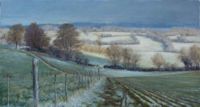
Bill Dale Award, John Jarratt, 'Late Snow near Ayot St. Lawrence'.
The Mayor’s Award – best 3D work, Nigel Earle, ' After GR'.

The Edward Mason Award – Best Watercolour, Trevor Chamberlain ROI RSMA, 'Evening Shade, Archers Green'.
Visitors' Choice Award,
Trevor Chamberlain, ROI, RSMA,
'Rainclouds over Malden' Watercolour.
Winners of Critique Sessions 2016-2017 season
![]()
Celia Sanders,
April 2016,
Datchworth Harvest - Pastel.
John Jarratt,
September 2016,
Out On Its Own - Oil.
Rita Dare,
October 2016,
Winter Glow - Oil.
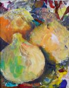
Margo Ward,
Joint Winner November 2016,
Onions - Mixed Media.
![]()
David Stowe,
Joint Winner November 2016,
Osprey Lake, Panshanger - Oil.
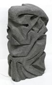
Kathy Burman,
Joint Critique Winner December 2016,
Echoes - Thermalite Block.
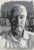
Geoff Bennett,
Joint Critique Winner December 2016,
Self Portrait - Linoprint.
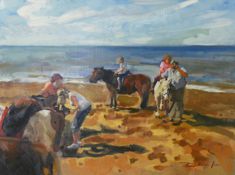
Craig Lee,
Critique Winner
January 2017,
On the beach, Hunstanton - Oil.
Craig Lee,
Critique Winner
March 2017,
Hope - Oil.